HOUSE TOUR // #SPRINGINTOHOME TOUR WEEK 3: My Home Tour!
It's week 3 of our #SpringIntoHome blog series and today I'm sharing a tour of our own home from Swift Current, Saskatchewan! It's been so fun teaming up with these amazing women to each share our homes with you - make sure you check out their websites and blogs as well!
Centered by Design - Instagram | Blog // View from my Heels - Instagram | Blog
Doreen Corrigan - Instagram | Blog // Bria Hammel Interiors - Instagram | Blog
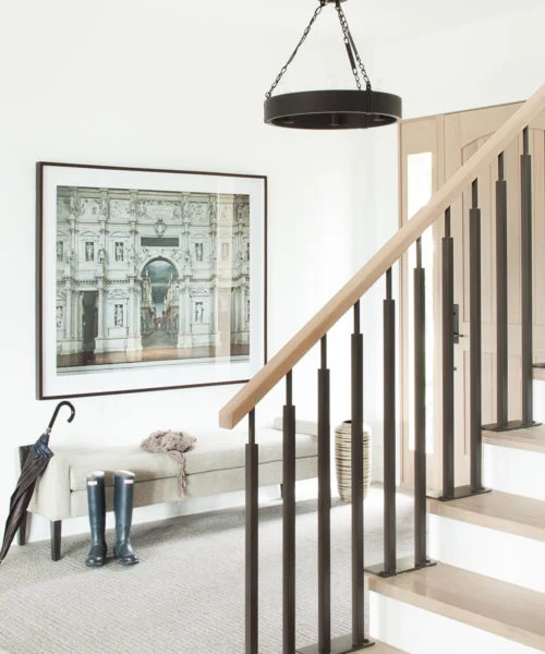
We've lived in our home for just over three years, since just after we got married. It was in pretty rough shape when we bought it and we started renovating before we even moved in. Our renos involved shifting the stairs to allow for a larger dining room, taking out some of the interior walls, moving a few of the windows, and completely re-configuring the main bathroom. I'll spare you the 'before' photos here but if you're interested, check out the link at the end of this post.
Our home isn't huge but, having done almost all of the reno work ourselves, it's been a labour of love and suits the two of us great for now. I'm happy to say it's basically completed now - we finished the basement a year ago and the exterior this past fall.
The retro chair in our living room was my Granny's - she's long passed away but I remember it in her house from when I was a kid. It sat in my aunt's garage for a long time and last year I finally had it recovered in a gorgeous green velvet from Robert Allen. I love that it has a new life now and reminds me of someone I love. If I start my day early enough, I perch there for a few quiet moments in the morning. The cow hide rug was purchased on a trip to London in 2012 (and it still looks as good as the day I bought it!).
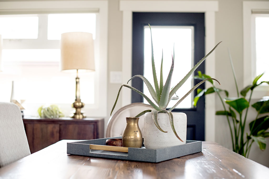
This gorgeous dining table was made by a friend, Nathan from One Prairie Craftsman. You need to check out the amazing things he can build!
Quite a few of the pieces in our home are vintage finds, actually. I always appreciate how vintage accents add depth to a room and tell a story - not to mention the constant thrill of the hunt when I unexpectedly stumble across something lovely. The brass lamps (below) we're totally thrifted and were in such great shape, I didn't change a thing about them!
I'm a big believer in having things in your home that are personalized to you and hold meaning in some way or another. For me, that especially goes for the things I hang on my wall. Two of my favorite passions, besides interior design, are traveling and photography - I love framing photos I've taken from travels or experiences because they always evoke a memory when I take time to stop and look at them. Oh, and plants. You may have noticed I like plants too.
The kitchen was one of the biggest projects that we tackled with this house but of course, it was so worth all the work we put in to be able to have a more efficient space and the open concept layout we wanted. The island is quite large and is the hub of everything that goes on in our house. When we have friends over, often the women gather around the island and visit while the guys are in the living room space. The WestElm pendants have a presence but don't take up much visual space which I love.
This pretty little scale was my Grandma's (on the other side of the family) - when she lived out at the farm, it was used to weigh all sorts of things from butchered chickens to garden vegetables.
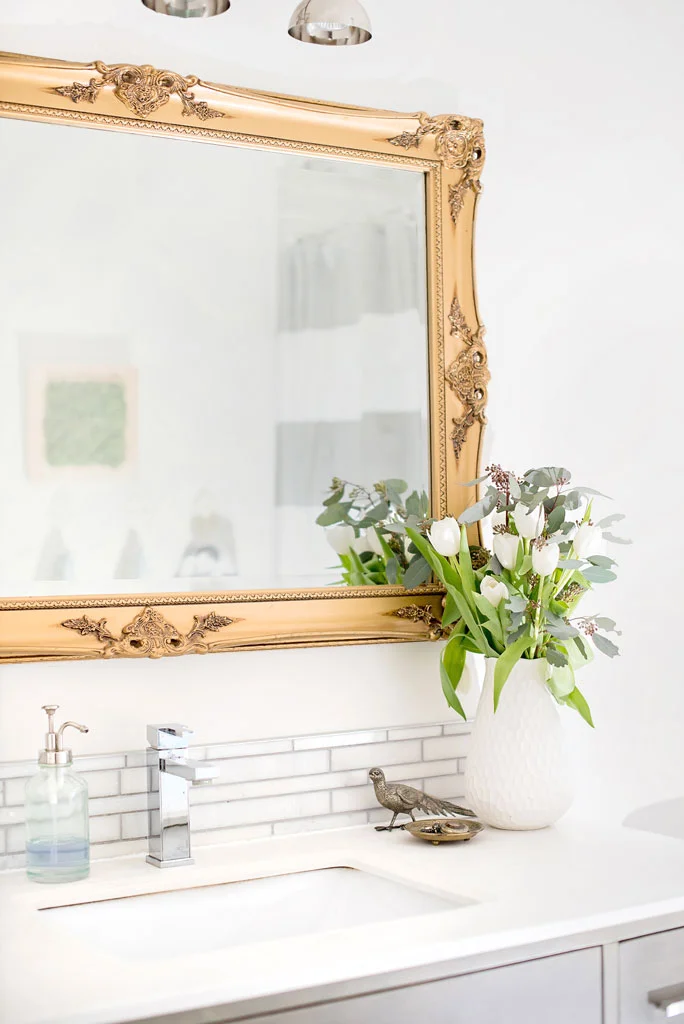
When we have people over for the first time, the bathroom gets the most comments. Again, I'll spare you the 'before' photos but this room was pretty hideous when we bought the house - untouchced since 1967. We removed the home's main boiler stack that was taking up too much space, re-jigged some of the plumbing to move the shower placement, and re-configured the windows to allow for the most natural light possible. The mirror is an auction-sale find and the moss wall frame (it's real!) is from my friends at Wildflower Florist.
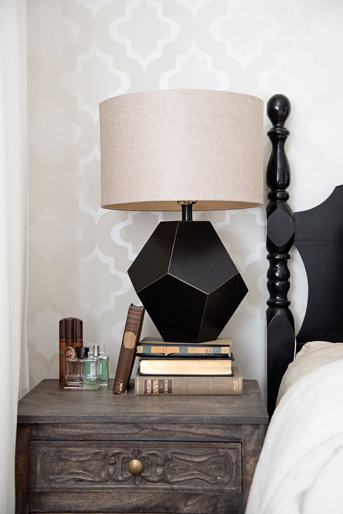
The master bedroom has been an ongoing project and was one of the last rooms I focused on (although the Clarke + Clarke wallpaper was one of the first things I ordered for the reno - almost four years ago!). I'm learning that beautiful, quality-made bedding is something worth investing in and I'm loving our new linen bedding from Loomstead. It breathes so well and the linen adds great texture, whether it's summer or winter.
Vintage finds in this room include the bed frame which we spray-painted, the gold mirror, and the dresser (it was in my husband's family and now we have it). Moving the bed off-center to the room is one the best tricks to make a small room feel larger - now we have some walking space on the door side and it's made a huge difference. The evolution of this space is almost complete, I'm just waiting to find the perfect piece to hang above our bed.
Well, there you have it! I hope you enjoyed catching a glimpse into our home and have picked up some helpful tips or ideas for your own space. Up next on #SpringIntoHome is my friend, Claire from Centered by Design. Claire and I connected at the Design Bloggers Conference this past March and I'm so happy to have met her! You may remember her as another blog award winner in the 'Best Blog Writing' category. It's fun to get to know Claire more as our design journeys are following the same path lately - this morning she was featured on LuAnn Nigara's 'A Well Designed Business' podcast (where I learned she has a background in journalism - makes sense that she won Best Writing!) - and I'm thrilled to say my interview with LuAnn airs this coming Wednesday! I'll be posting links to the show and more about the interview on Wednesday so stay tuned!
Oh yeah, to see the 'Before + After' photos of our home reno, click here.
Photography by Candace Schwartz of Jackson Designs
UPDATE:: For an inside look at my home office and design studio, check out our feature on Designerlebrity!


