HOUSE TOUR // #SPRINGINTOHOME TOUR WEEK 2: BRIA HAMMEL
For the second week of #SpringIntoHome, we're featuring the home of Bria Hammel, Principal at Minnesota-based Bria Hammel Interiors. Her home is bright, fresh, and definitely has a spring-y vibe that I know you'll love.
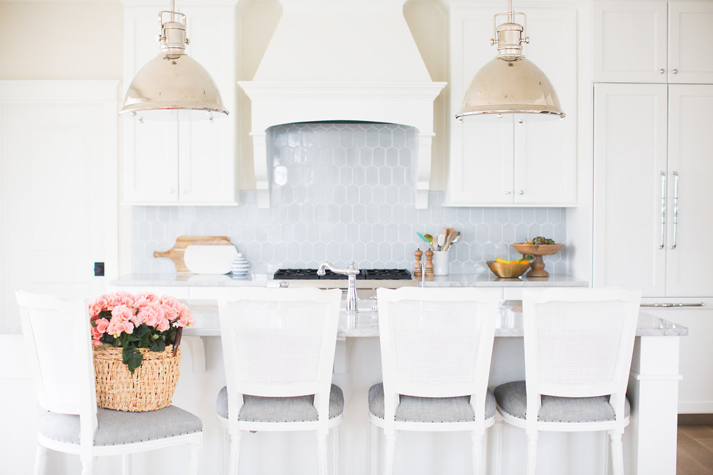
Bria's kitchen is super light and fresh. One of the first things I notice, besides that stunning Walker Zanger backsplash, is how balanced this room feels. Her island looks like an awesome place for kid's homework, serving snacks, and baking!
Okay, I think we've found it guys... Pantry Paradise.
I think I could sleep in there... that's how happy this organized room makes me feel.
Bria's styling definitely takes this room to the next level, but, if you look closely, you'll notice the shelves look like regular white shelves - probably similar to many of ours. This gorgeous space is so attainable, in whatever form your pantry takes, even if it's just one cupboard or a few open shelves in your kitchen. By using storage solutions such as wicker baskets, glass jars, and open crates, the whole room feels functional + organized. Even the paper towel looks poised.
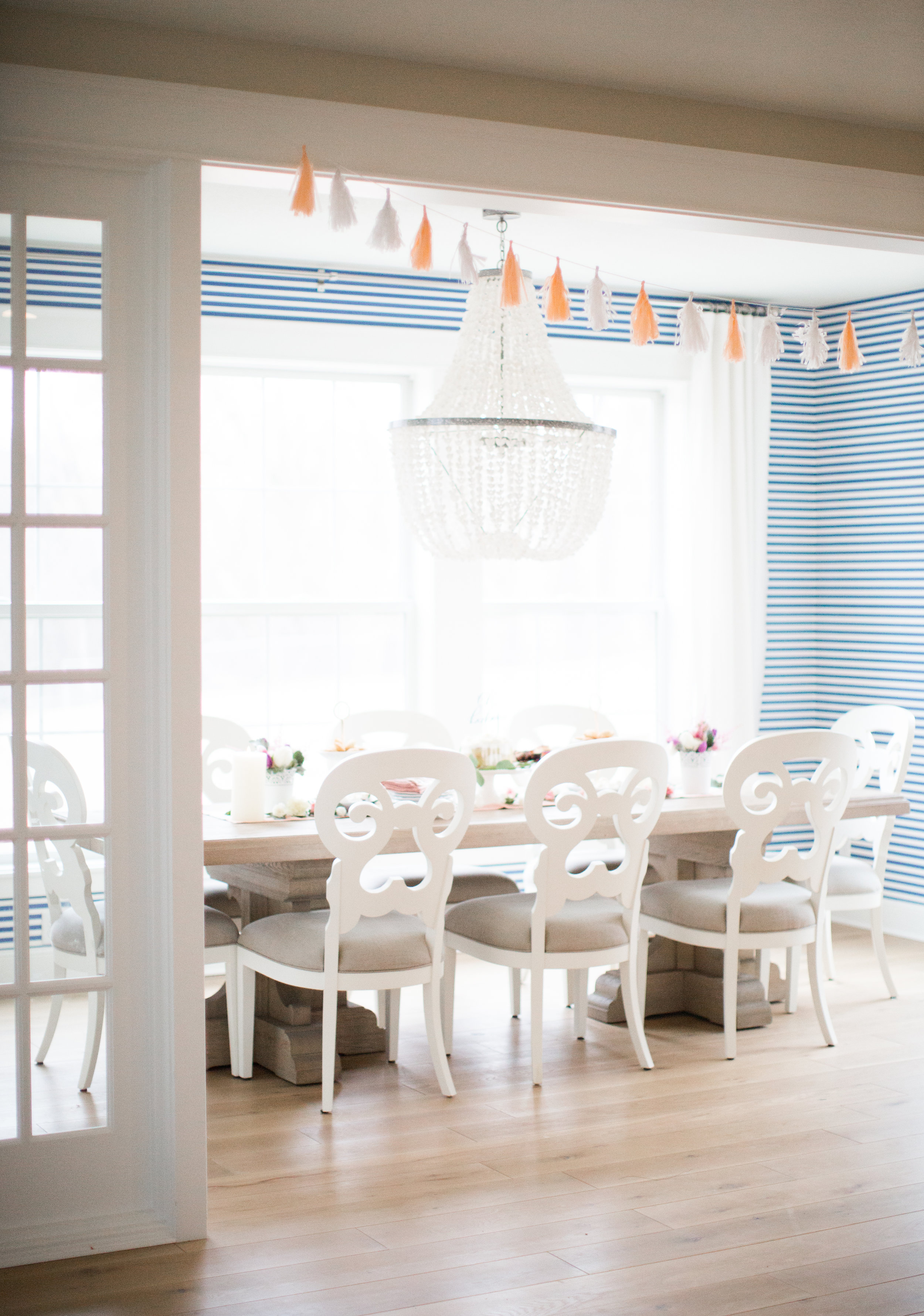
How fun is that striped Farrow + Ball wallpaper in the dining room?!
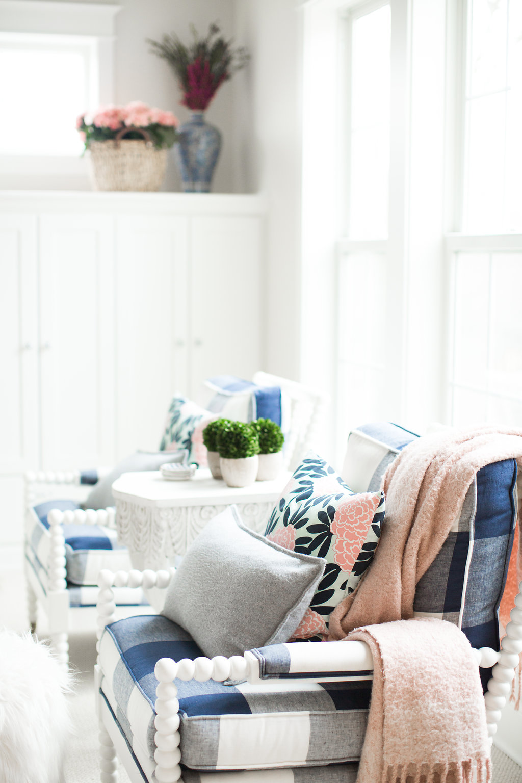
Having only been in their new construction home for a year and a half, drapery in the great room is one of Bria's next projects. With that gorgeous natural light coming through and the fun buffalo-check printed chairs, I'm excited to see what she picks to tie the room together!
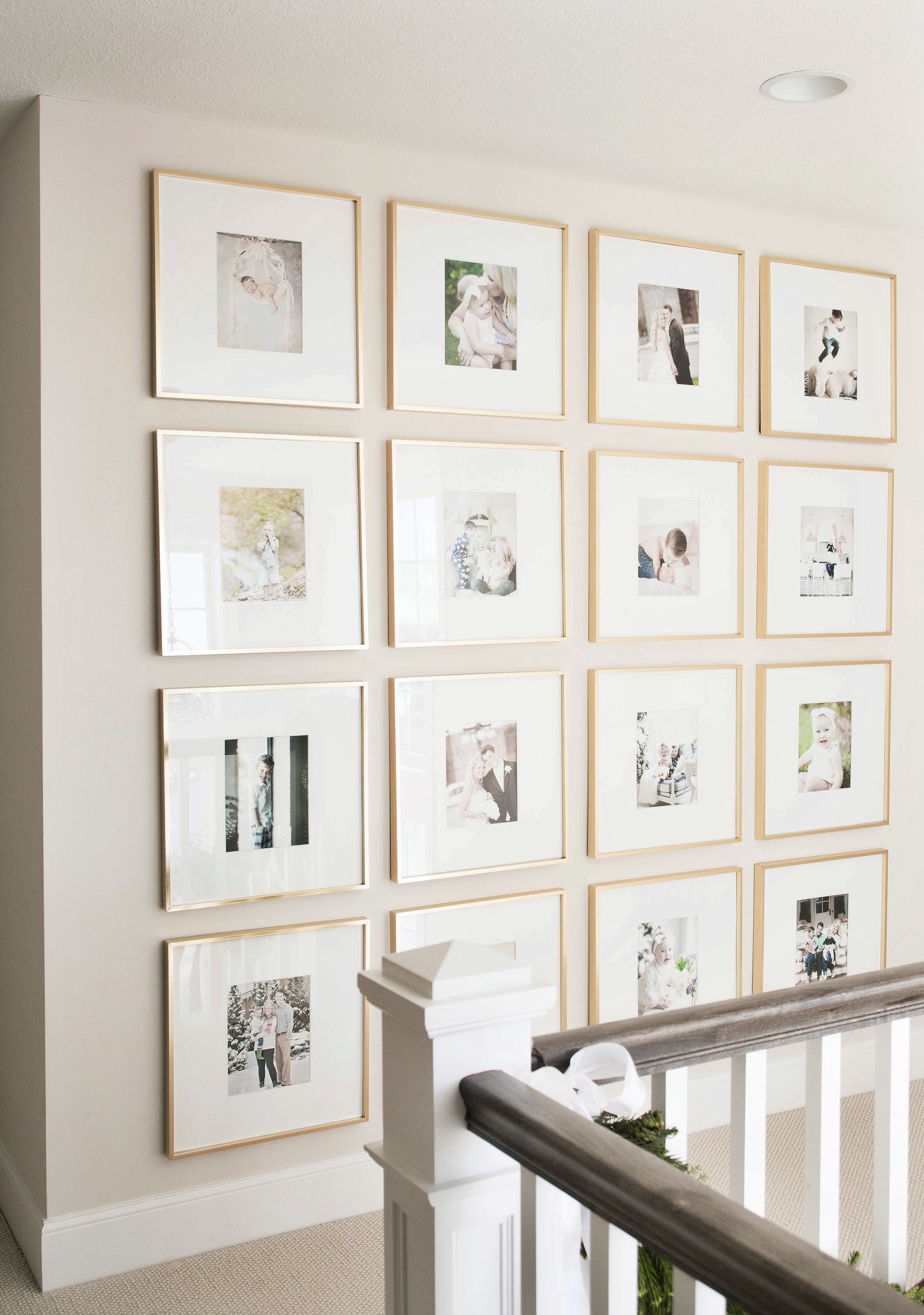
It's so lovely to see family photos prominently displayed in Bria's open stairway landing. I love how she used the same frame and matte styling to really highlight the photos themselves. Altogether, the frames read as one huge art piece that speaks to life's favorite moments as a family.
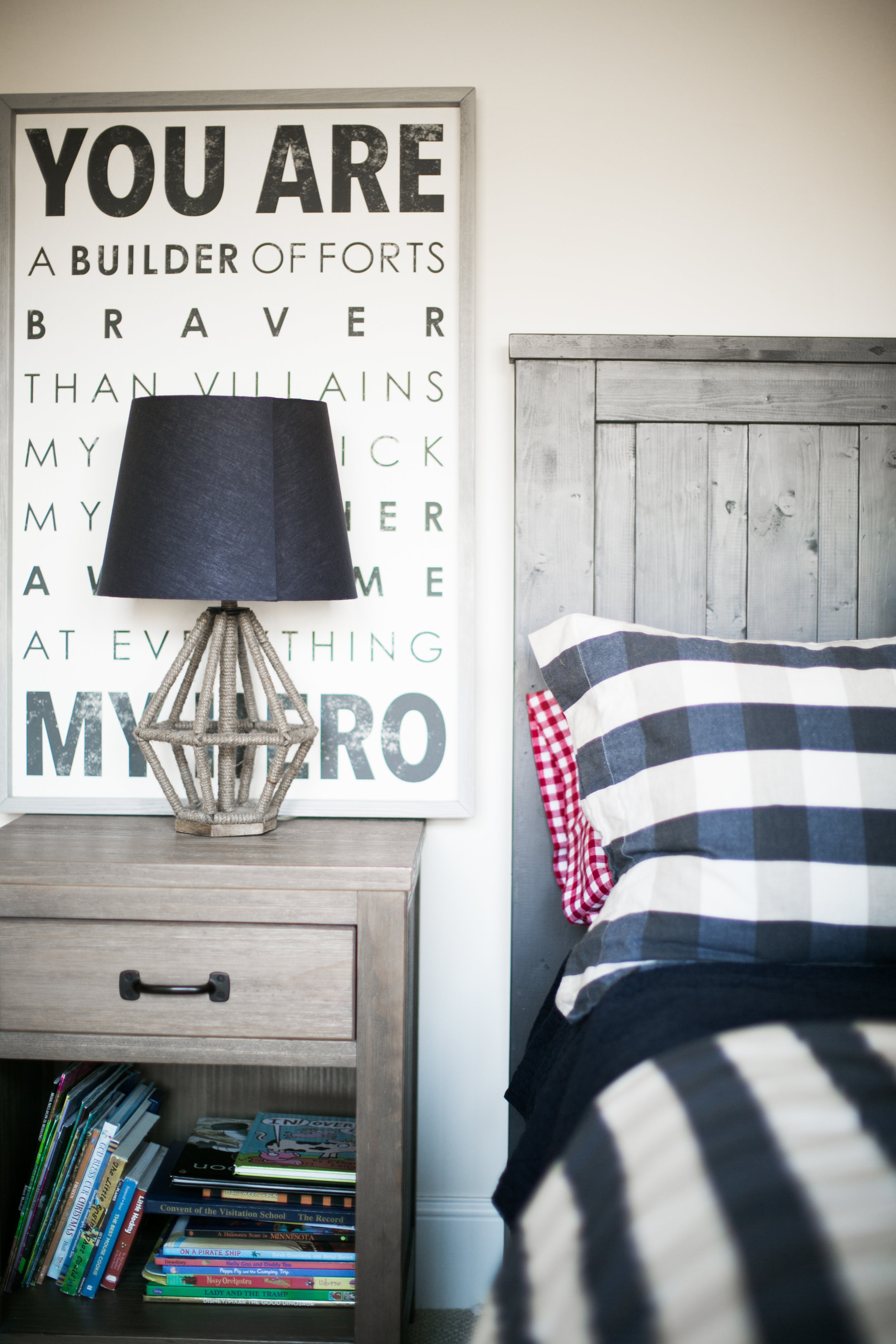
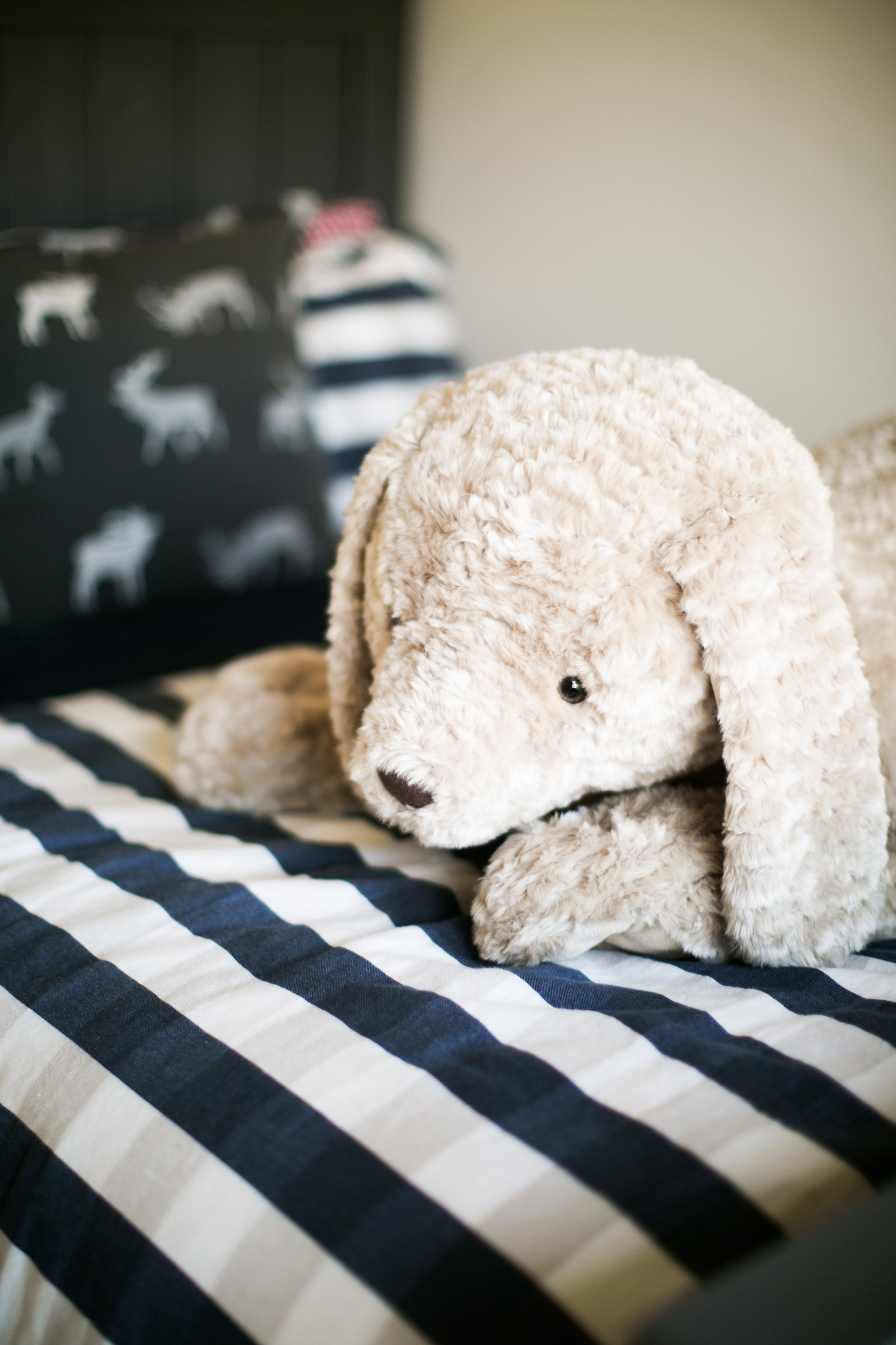
Upstairs, is a totally boy-ish yet incredibly adorable kid's room for their son, Louie. The elephant painting was done by a friend of Bria's, Rachel Brown. Check out her work at Rachel Brown Art to see more! I didn't notice it at first but the light fixture is a timeless, 'grown-up' piece that will still look great, even as Louie's room is likely to change over the years. Nothing is lost on spending time to ensure that the investment you're making in certain pieces for your home will serve you well through time and trends.
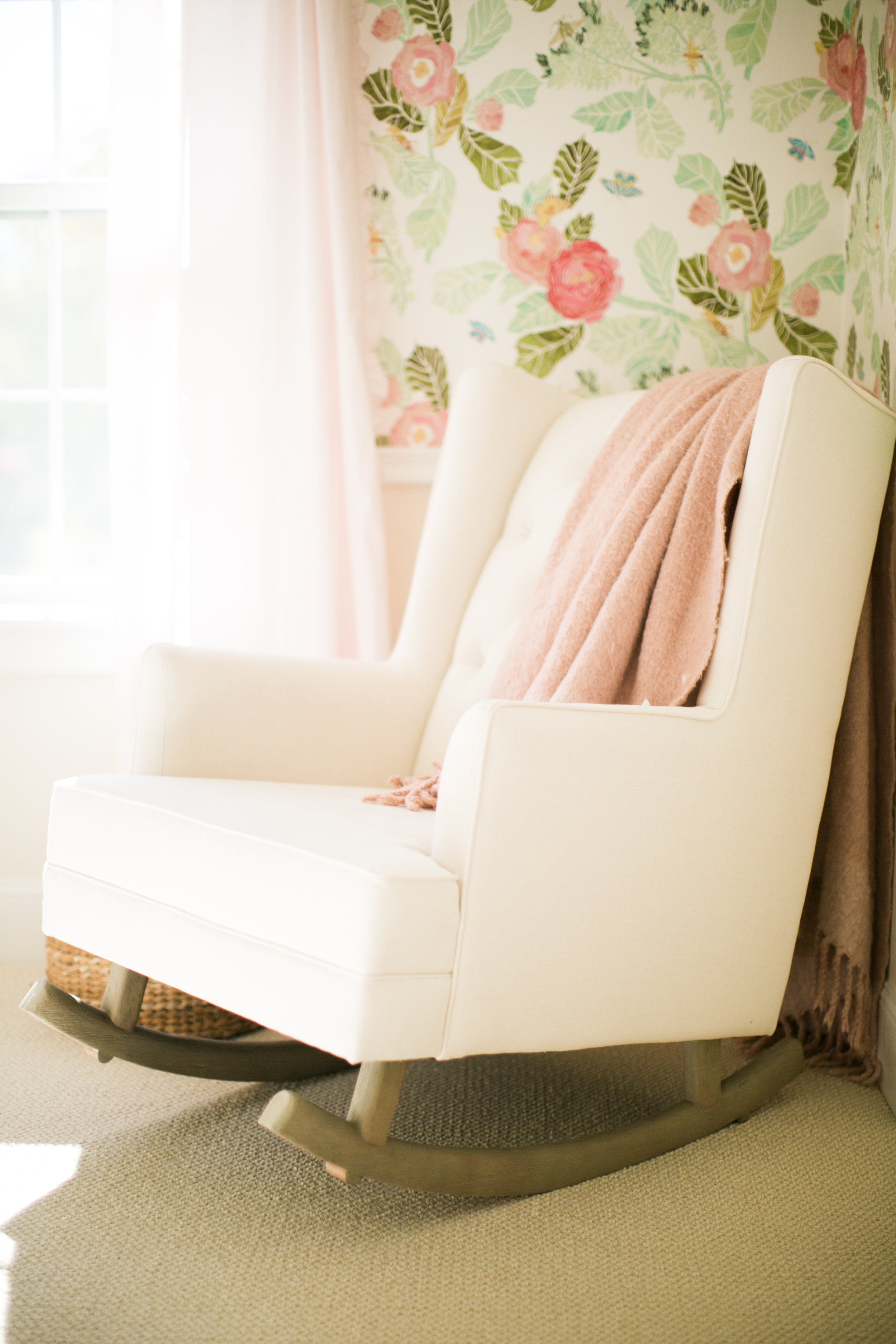
Their youngest, Brooklyn, has the sweetest nursery for a little girl. I know I wouldn't have any trouble spending time with that Watercolor Flora wallpaper from Anthropologie.
Heading back downstairs, I left my favorite room of Bria's for the last...
Her mudroom has so much character, mostly thanks to her fabulous choice of wallpaper + clever use of green and pink. Here's what Bria had to say about her use of wallpaper in her home:
“I can’t get enough of it; to me, it’s what takes a design to the next level. In order to not become the crazy wallpaper lady I’ve had to be very selective about where I am installing it in my own home, and I’ve made sure to be absolutely in love before I commit to it. Well, our new mudroom wallpaper is just that. This Hygge and West wallpaper makes my heart flutter... every single time I walk into the room.”
I hope you've enjoyed the second week of #SpringIntoHome!
Next week I'll be sharing photos of our own home, something I've been meaning to do for a long time...I guess I just needed these lovely ladies to help me get my butt in gear and get it photographed! Check them out if you get the chance, I'm sure you'll be just as inspired by them as I am!
Centered by Design - Instagram | Blog
View from my Heels - Instagram | Blog


