PROJECT REVEAL // AIRPORT ACREAGE
On Instagram: #FDairportacreage
This project is one of our most comprehensive to date + we are so excited to share this home reveal! The ‘Airport Acreage’ project is a new-build that was designed to be our clients’ forever home. An awesome young family of four, our clients asked us to help them create a warm + classic look that still felt fresh + current. We joined them early in the process and were able to have a hand in many of the home’s custom features. From the baseboard profiles to the custom ceiling treatments, every element in this home was thought out + deliberately designed, working together with our clients + their builder.
We’re are going to share the reasons behind some of the design selections, styling choices + our thoughts on how to collaborate with a build team. This is going to be a long one - we’ve got details on the living room, kitchen, main floor powder room, bedroom + ensuite so stick with us to the end! But first, a huge ‘thank you’ to our clients - without their trust in our Full Service Design Process, we couldn’t do what we love to do which is helping our clients create homes that they love spending time in.
Here’s a thought from our clients:
“When this house first started as a dream ... we contacted who we felt were the best contractors around to build us the house + I believe that was the same when we chose Kelsey with Farmer’s Daughter to help us through the design process. She is really the best of the best.
One thing I enjoyed about Kelsey was her professionalism - I knew that when she was talking about things, we could trust her. She garnered a lot of respect from the trades that went through this house with her knowledge.”
GREAT ROOM
Our clients wanted a more timeless so look we kept major elements like the flooring, lighting + mouldings on the classic side. In the great room, the fireplace features a striking patterned tile which creates a captivating focal point when you walk in to the space. We chose this particular tile to create a showstopper feature for the great room that contributes to the ‘fresh’ feeling that our clients were after.
One of the things that make a custom home truly special is being able to incorporate unique features that are designed specifically with our clients in mind. Our job as a design team is to help our clients create a clear vision and then to help communicate that vision to the rest of the team. Collaboration is key here. During the build process there were many on-site visits, working in tandem with our clients + tradespeople. This can be a challenging aspect of design work but in the end, the product of collaboration is very rewarding and can achieve some really unique results.
One of the unique features on this home is the custom bench seating on either side of the fireplace in the great room. These benches can function both as a private reading spot + extra seating for guests. Collaboration occurs at every step of the design process for a feature like this. They start as a concept that we pitch to our clients, which then turns into a drawing. Next we bring that drawing to the tradespeople involved and from there we navigate bringing this drawing into reality.
We count ourselves very fortunate to work with tradespeople + builders that are willing to try things they’ve never done before + that openly communicate with us, so that we can create something amazing together.
Styling Airport Acreage
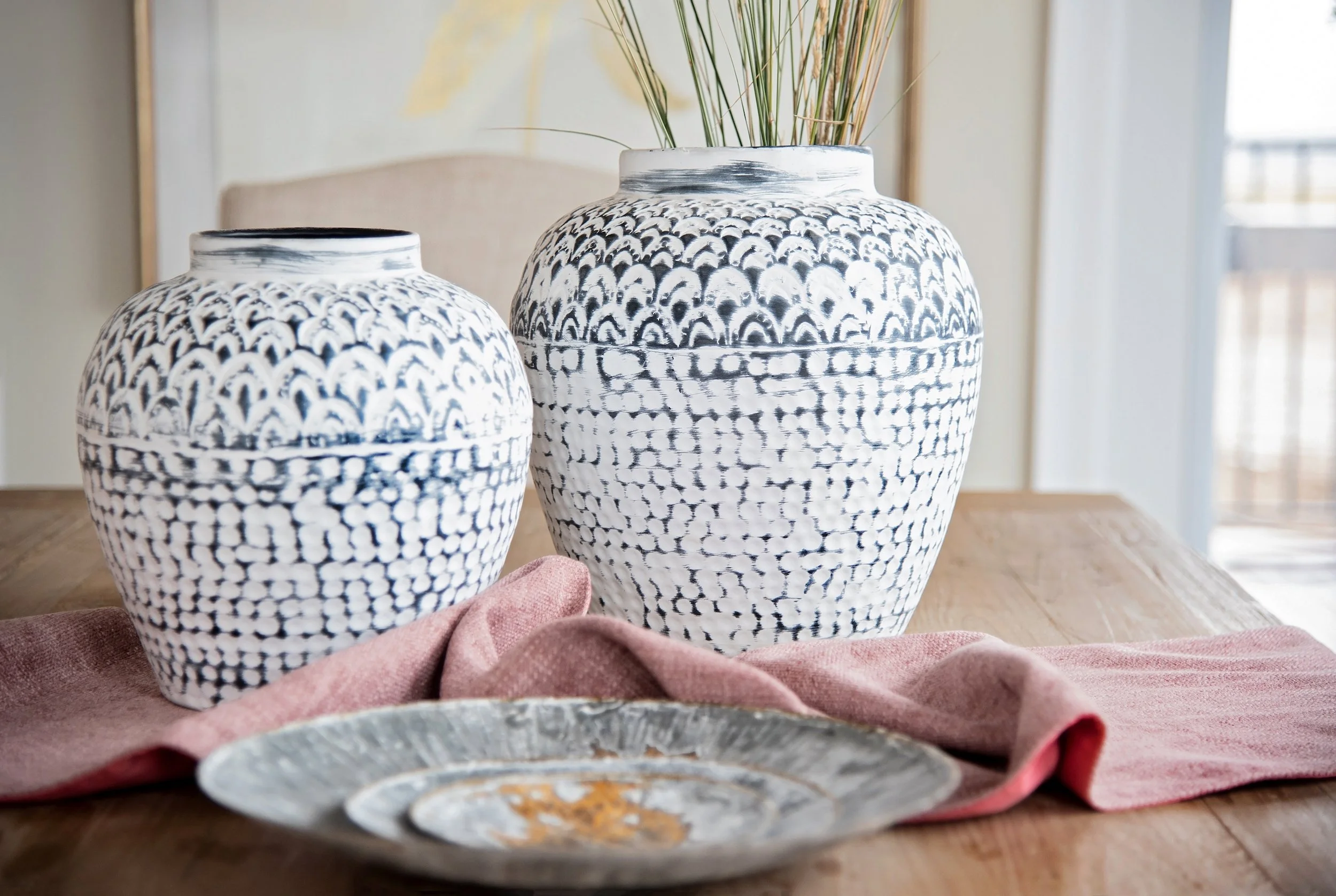
By using more a neutral colour palette we were able to add interest into the living space by playing with high-contrast accessories + layering in texture. The accessories that we used can be shopped here: Farmer’s Daughter Homestead
A defining trait of our style at Farmer’s Daughter Interiors is an eclectic mix of patterns + textures that live well together + complement one another. The modern lines found in the side tables are softened by the textiles (wool rug, linen pillows, wool throw).
These styling elements build on the existing design to make this space feel warm + inviting - a space that this family can enjoy together.
KITCHEN
Moving on to the kitchen and dining room - one of the most important spaces in a home. Design is about so much more than just the aesthetics - the spaces we create also have to live well. Our homes are where we spend our everyday + the kitchen and dining room is where we make our memories as a family - sharing weekday suppers or weekend brunch. We keep this idea front of mind when designing the cabinetry layout, selecting materials + finishes, + styling.
We love the quartz countertop for the durability it offers. To keep this very white space looking warm we chose to mix metals - using stainless appliances with brass toned hardware. The cabinetry throughout the home was hand-built by a local craftsman making it truly one-of-a-kind and allowing for a unique door profile that is a twist on a classic. The work + skill that our craftsmen bring to projects is vital. These tradespeople bring our drawings to life + bring the vision to fruition, all while offering years of valuable experience we can learn from as designers.
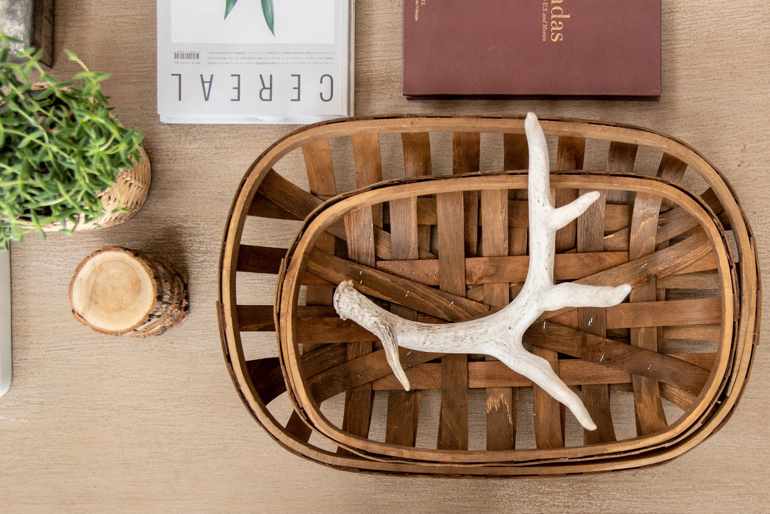
Some styling notes in the kitchen : adding in some fresh greenery really brings life into the room + by using some "FOUND.” pieces (like the wood egg crate on the counter) we are able to build on the character of the home.
OFFICE
For this home office our clients agreed to go bold + we couldn’t love it more! This space is actually one of my personal favourites in this home. The green paint colour has such a timeless, regal feel to it. Our clients’ existing desk was just the bit of texture this room needed to finish it off and the cognac coloured leather chair this space is perfect for getting work done on a chilling fall evening.
POWDER ROOM
We love how this powder room turned out! Sometimes when working on a project of this size there are moments where it feels like we’ll never see the end - and I love looking back on progress shots + seeing how this room has changed! Our clients had found this stunning navy vanity + we had the perfect wallpaper in mind to match. Finishing touches like lighting, mirrors + styling accessories finish off the look + this turned into such a darling space!
MASTER BEDROOM
Moving upstairs into the Master Bedroom…
We wanted this space to be a relaxing escape for our clients - somewhere they want to unwind at the end of the day + look forward to waking up in every morning. In a master bedroom we are really mixing styles - so both of our clients recognize themselves represented in this space. To accomplish this we focus on balance by mixing in variety. We landed on this beautiful ceiling light that has more of a feminine silhouette + juxtaposed that with the bench at the end of the bed. The iron finish + square lines feel a bit more masculine and contribute to the balance of this space.
EN SUITE BATHROOM
Last but certainly not least is the ensuite bathroom. Our clients wanted a fresh feeling space, that still felt comforting + warm. Bathrooms can tend to feel sterile + cold so we chose to layer in warmer tones like the brass hardware + wood toned tile that gives the feeling of wood with its organic finish but still offers the durability of ceramic.
The accessories used to style this space also contributed to the warm + comforting feel - the mix of cream tones in the mother of pearl side table, the tactile look of the felt wall art + the wood accessories.
And that is it! Our dream for this project was that it would become a space where this family could grow + make memories together. That this new house would feel like home. Together with the trust of our clients, along with the craftsmanship + skill of the tradespeople we worked with, we were able to watch this custom home come to life.
This project was featured on the Scout + Nimble Blog which you can check out here! We also did a Q+A on running a design firm in a small town that you can read here!
Do you have a new build project that you’ve got in the works? Let us know if the comments below or get in touch with us + tell us about your project!


