BEFORE + AFTER // Farmhouse Refresh project reveal
The FARMHOUSE REFRESH project
On Instagram: #FDFarmhouseRefresh
It’s often said, the kitchen is the ‘heart of the home’. We couldn’t agree more and on the farm, that statement is even more true. Authentic farmhouse kitchens work over-time. It’s where we create memories with our family, visit with our community of neighbours + cook up delicious meals for our hard-working crew during the planting + harvesting seasons.
Changes to the kitchen can be some of most dramatic transformations you’ll see in a home renovation and our ‘Farmhouse Refresh’ project is no exception.
What started as a drab + dysfunctional space has been completely revamped into a fresh-feeling farmhouse kitchen with an air of timelessness that will serve our clients for years to come on their family farm. Since we’re well into this year’s harvest season here on the Prairies, we thought it timely to share the ‘before + after’ of this true farmhouse kitchen with you now. But first, the ‘before’.
Our clients wanted to update their kitchen in a way that felt fresh but classic, and that would function well for life on the farm. During our initial on-boarding interview, we helped them identify a few main priorities that floated to the surface during our discussions: practical storage space + more of it, functional lighting, + a timeless look they wouldn’t tire of quickly.
We started by making some changes to the layout. In the original kitchen, the stove + fridge were crammed into an alcove that left no counter space on either side of the stove which wasn’t really functional for cooking any kind of meal, let alone cooking for larger farm crews.
We presented our clients with two options for a new layout, and landed on this one…
By relocating the stove + fridge to the opposite wall + adding a custom hood fan, we created a central workstation and focal point in this kitchen that’s not only beautiful, but much more functional. Changes were made to the lighting as well, with potlights added and statement fixtures over the island + sink area. We also removed the bulkhead over the sink to let in as much natural light as possible + a lighter paint colour helps this kitchen feel refreshed + alive.
The cabinets in the original kitchen were mounted under a bulkhead and we knew we could gain some valuable storage space just by taking the new cabinets to the ceiling. We also created a feature cabinet that’s perfect for storing dishware, linens, + cutlery for easy access everyday.
The ivory brick backsplash is a nod to the original + gives the kitchen a ‘new-but-not-too-new’ feeling by contributing to the timeless feel our clients were after.
In the alcove where the fridge and stove used to be, now sits a built-in pantry that houses floor-to-ceiling storage. The doors open accordion-style and actually fold back into the pantry unit so that our clients can open up this area without impeding the walkway to the dining room. Pretty clever, if we do say so ourselves ;)
While there wasn’t room for a huge island in this kitchen, we felt even a smaller island still provided tons of practicality and a perfect prep-space for baking and buffet-style meals. The dark quartz countertop feels timeless and will clean up well after a rainy day of baking or a messy afternoon of lasagna-making. Imagining our clients actually using the space and constantly analyzing their needs throughout the length of a project, is a big part of how we work and ensures that the design is fitting to their lifestlye.
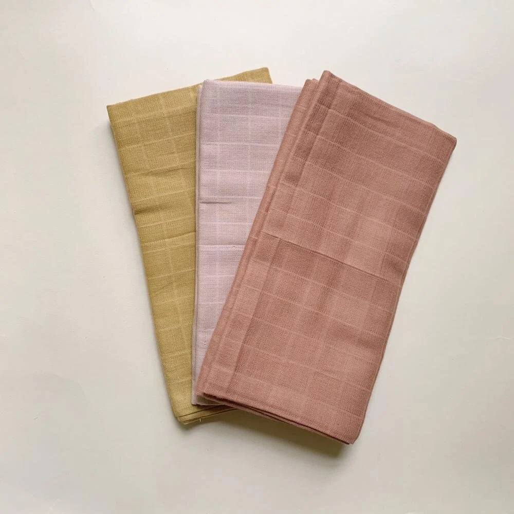
Our clients trusted us when we pitched this pretty sage green colour on the island + agreed that the sliding vegetable bins were an awesome addition. They’ll hold fresh garden produce and keep vegetables handy for meal prep (and save space in the fridge!).
One of the most important things we do as a design team is to empathize. We work through all the details (‘is this layout the most efficient use of space + storage?’, ‘what is the hand-feel of this piece of hardware?’, ‘which materials are going to hold up to the traffic in this space?’) and draw on our experience + knowledge to help our clients make selections from there.
We’re designing with empathy so that a space lives well.
Personally, kitchen renovations (and bathrooms too) are some of my favourite to design. They’re definitely the most complicated spaces in a home to renovate but, they offer the biggest rewards… not only in adding value to your home, but value to your everyday as well.
Getting back to our clients’ top three priorities (storage, lighting, and a new look), it’s all the little details, like the extended crown moulding, face-frame cabinetry, oversize roman shade, and an array of mixed metals, that work together to create everything our clients wanted from this kitchen.
For the entryway to the farmhouse we knew we were going to need to select a durable material that would hold up to the traffic that comes through this space + something that felt cohesive with the rest of this kitchen. This patterned tile just checked all of the boxes - durable, classic + beautiful.
Here’s the final ‘Before and After’ full room shot…
No design project is possible without the support and collaboration of multiple team members + talented tradespeople and we have to say a huge ‘thank you’ to the team from Bella Vista on this project. Of course, another huge ‘thank you’ to our clients who trusted us with their home, weathered the inevitable ups and downs of a renovation with grace, and were an overall dream to work for.
Hope you enjoyed our latest Project Reveal! Check out some more on this project on Instagram at #FDfarmhouserefresh and follow along on Instagram for more updates on our other projects as they happen.
Photograhpy: Delina Langridge
Cabinetry: Bella Vista
Lighting: through Farmer’s Daughter Interiors
Accessories: Farmer’s Daughter Homestead


