HOUSE TOUR // #SpringIntoHome TOUR WEEK FIVE: MEREDITH RODDAY
Welcome to the final week of our #SpringIntoHome blog series! If you're new here, some lovely ladies and I have been opening up our homes to you for the past five weeks and sharing an inside look into our homes and how we get them ready for spring! Make sure you take time to view the rest of the tours too!
Today Meredith Rodday of View from my Heels is sharing her home with us. I adore Meredith's style and I think you will too!
As a blogger and design consultant, Meredith lives outside Boston, MA with her husband and twin boys, Charlie and Finn. Her home has a coastal feel to it with a mix of farmhouse charm and California cool. I just love it! The couple bought their builder spec home nearly five years ago and although they were very happy with the work done by their builder, Meredith has worked hard to add in those extra layers that make a house feel like a home.
The doorway to the family room originally had no trim but Meredith and her husband added shallow casing to help finish off the look - it's amazing what a difference those small details can make!
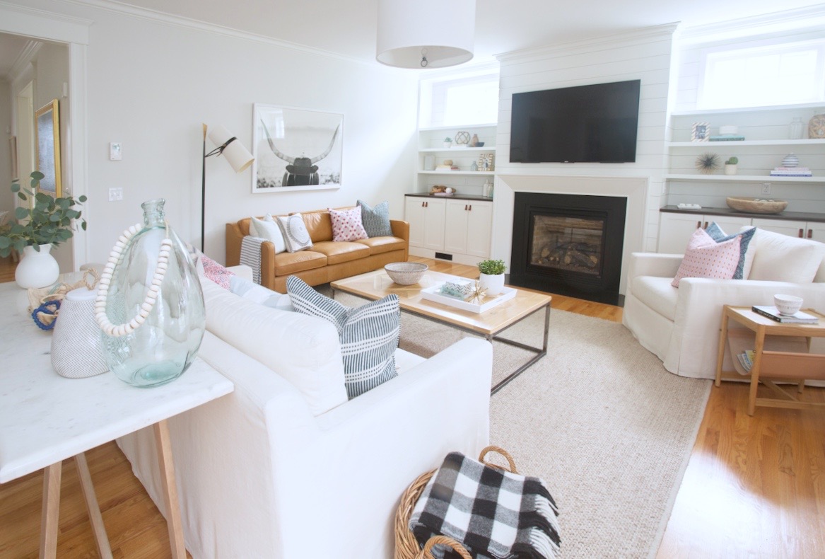
The family room is on the main floor and is open the kitchen and dining room but still feels like it's own space thanks to the clever furniture arrangement. Try backing a sofa onto the dining room and finishing it with a console table like Meredith did, if you have extra space. Also, did you notice the shiplap detail behind the shelves? According to Meredith: "During our improvement project, we covered the back wall in shiplap and redesigned the mantle for a much fresher, more modern look. There even used to be sconces where the TV is! Redoing this space was one of the best decisions - it changed the entire feel of the room."
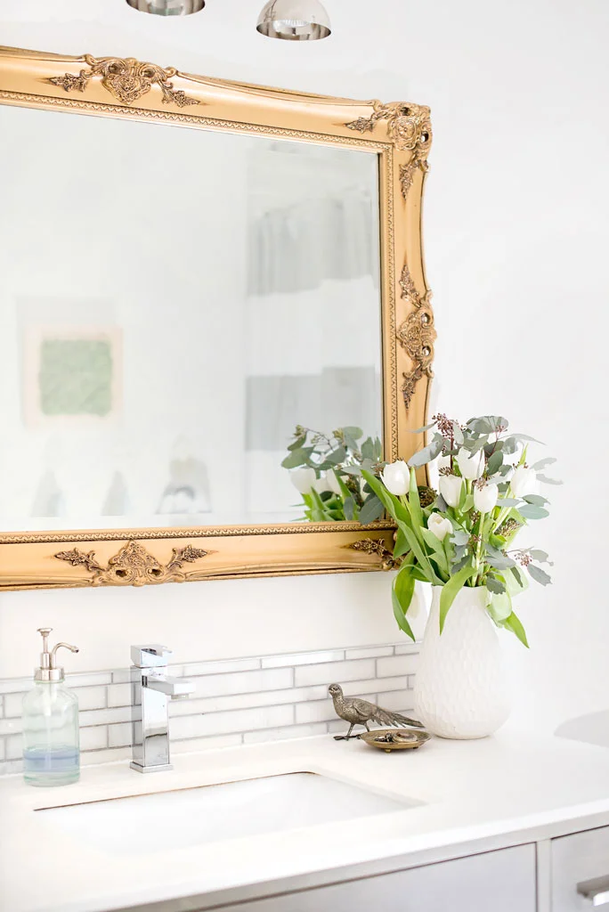
Before we move on to a few of the other main spaces, I have to show you this pretty little half bath. I love the blue and white Serena + Lily wallpaper, although Meredith originally wallpapered this room in hot pink and white which she says she regretted immediately - proof that we don't always get it right on the first try! In my opinion, our homes need to evolve over time - don't be afraid to let them change and mold with you as your family grows and changes!
Replacing most of the light fixtures in the home was another improvement made from the builder's spec and is where I think you can get a ton of 'bang for your buck' in terms of impact. Just take the brass wall light here for example - it catches your eye as soon as you see it and provides the perfect amount of warmth against the blues + whites in this room. Also notice how Meredith mixes metals with ease? Great work Mere!
Since moving in, the kitchen has seen a few high-impact changes as well. The hardware has been changed, a marble backsplash added, and a beige island countertop switched out for this marble beauty. Not that these are small changes but I'm always amazed by the difference even more minor upgrades can make in a space. The white cabinets are totally classic and allow for almost any design direction to be achieved with some tweaks to the space. Again, the lighting is a major influencer as well!
As someone who works from home, Meredith's office space gives me all the heart eyes. I could definitely work in this room with all the natural light. I love those IKEA shelves and how she customized the hardware (a design hack from another favorite of mine, Studio McGee) ... I just might have to steal that idea too, Mere!
Another great design tip to be gleaned from this room is the way Meredith layered two rugs. It's a perfect example of needing a larger rug to fit the space but then adding a more detailed, rug with color and pattern overtop to break up a large space without committing to a larger, often pricier, colored or patterned rug.
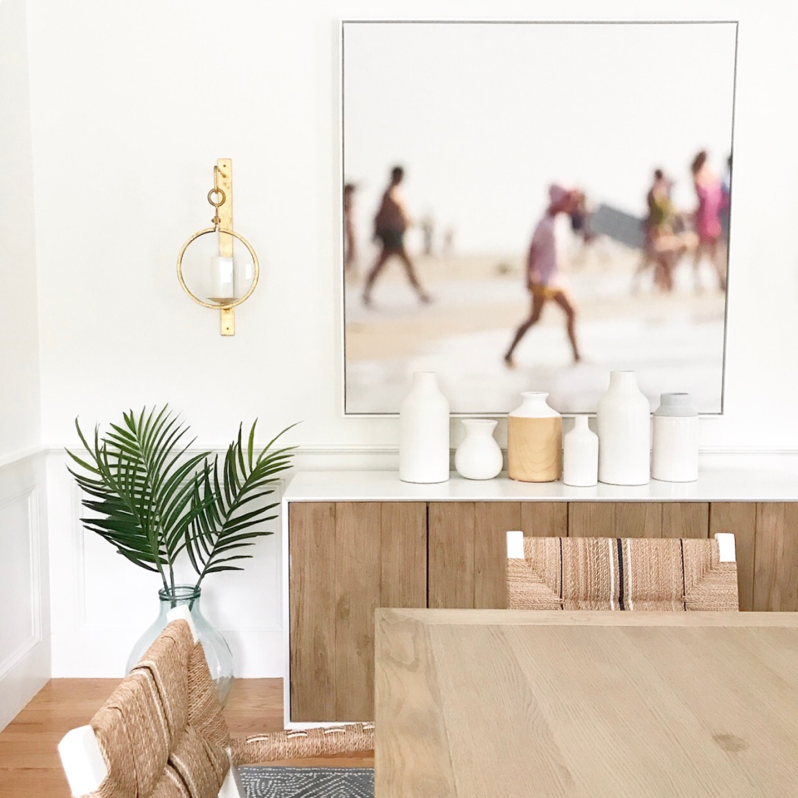
The dining room is the most recently completed space and boasts fresh, white walls, a new dining table and chairs, that gorgeous rug, and a freshly painted sideboard. The artwork was the starting point in this room and was the piece Meredith built from to help select the other pieces. If you're stuck on trying to decide on a design direction in one of your spaces, try first finding one piece you absolutely adore - whether it's artwork, a drapery pattern, a rug, whatever! - and build your room from there!
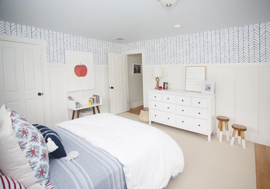
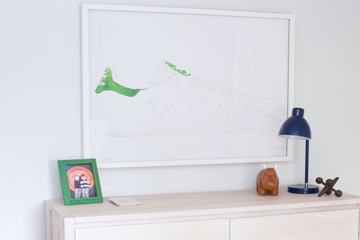
The boys' rooms: Charlie's room incorporates Meredith's classic blues with hits of red (his favorite color), while Finn's room has a bit of yellow for his favorite hockey team, the Boston Bruins of course! Notice the board and batten that was added in this room? Again, those minor upgrades can make all the difference!
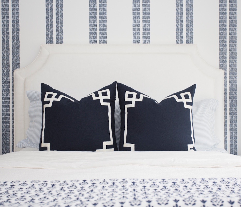
Heading downstairs, the guest bedroom is a place I would personally have no trouble staying in! To compliment the look in the rest of the home, Meredith chose blues, whites, and seagrass textures to give her guests that beachside feel. When designing this room, she created a design board to help visualize the look, check it out on her blog if you like.
The last room in our #SpringIntoHome tour is the playroom - Meredith designed the custom built-ins herself and chose a dramatic gray color which breaks up the large space. I can picture this space as an awesome hangout spot for movies, games, and playtime and as a room that will transition very well as the boys get older. What a great family space!
Photography by Kate Renyi of ker photography
Well, there you have it, the end of our #SpringIntoHome blog series! I'm definitely going to miss these Friday posts and have especially enjoyed getting to know Claire, Bria, Doreen, and Meredith - be sure to check out their blogs and follow their design journeys on Instagram as well. If you missed the first four home tours, including my own, they are below for you!
For more inspiration, check out our #SpringIntoHome hashtag on Instagram for behind-the-scenes snaps and feel free to post your own tips for getting your home ready for spring!


