PROJECT REVEAL// Fieldstone Reno
On instagram: #FDfieldstonereno
We are so excited to be sharing our Fieldstone Reno project reveal with you today! We are honoured to have worked with these particular clients for a second time and had previously completed a smaller-scale renovation with them, moving their two teenage children into bedrooms downstairs - and this time, the reno was more about creating a brand new space for mom and dad to enjoy.
Read on for all the details and some ‘before’ and ‘afters’!
Work in the kitchen and entryway included creating a walk-in pantry using part of what was the back entrance to the house. Down the main hallway, renovations to what used to be the kids’ rooms, allowed us to create a whole new principal bedroom and ensuite. The main floor bathroom + laundry room also each received an upgrade.
the kitchen
The homeowners had several priorities when it came to the kitchen, the most top of mind being: a larger fridge and cooking space on either side of the stove, a large island with seating for their family plus more, and a breakfast area with a bar fridge. The latter, meant to take the pressure off the main kitchen area with two busy teenagers vying for counterspace (think: morning smoothies or re-fueling after school), was a whole new component to the space.
before + after
When our client asked to forgo her dining room space for a 14’ island that could seat nine people, admittedly I wasn’t sure about the idea. After discussing her priorities and taking longevity into account, we talked through all the scenarios and decided that’s what fit her needs best! We designed the island with no appliances or a sink so it’s great for cooking, baking, homework or dining. We also created an L-shape dining space so the family could sit four comfortably around the island’s end.
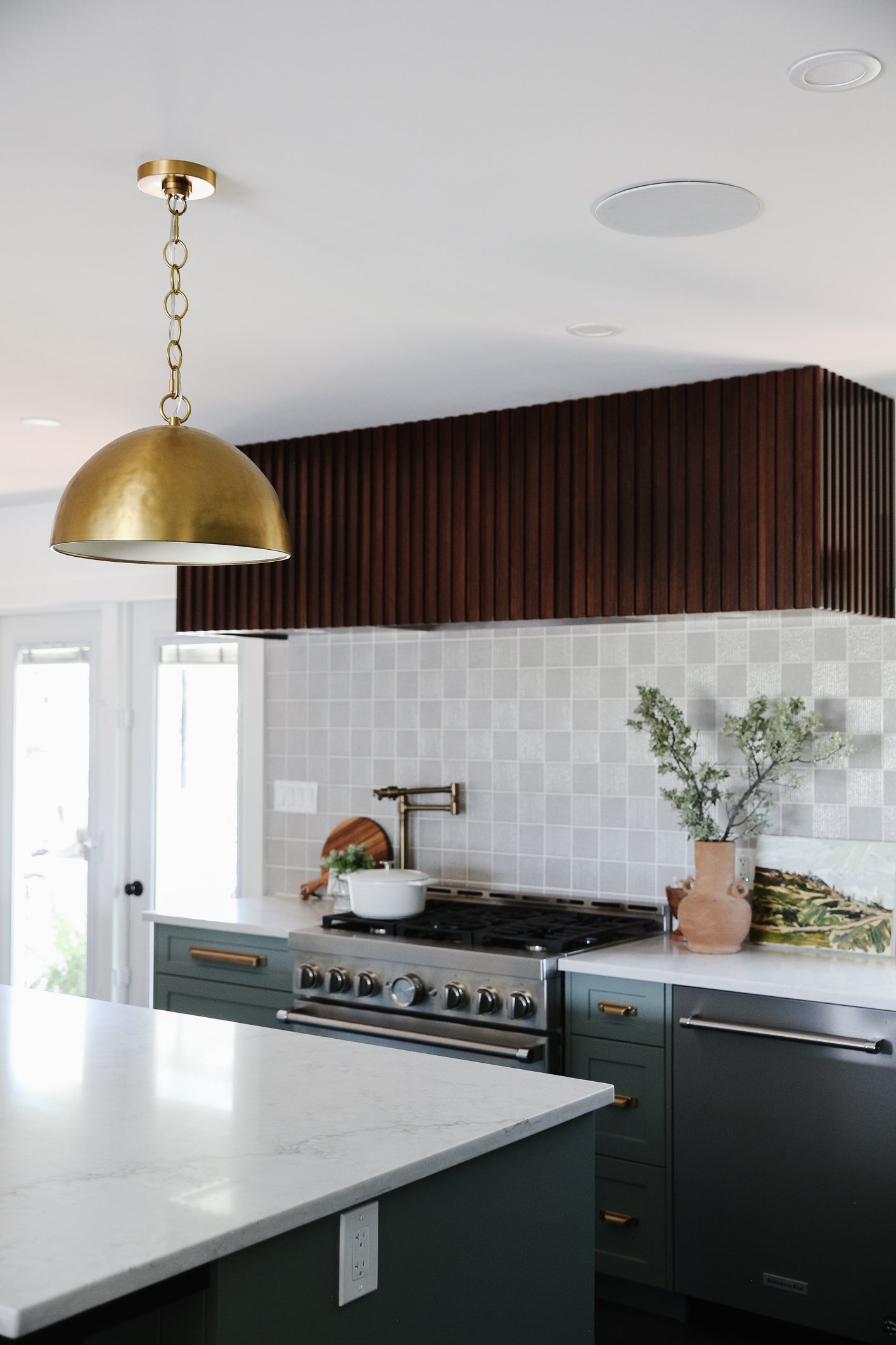
Our clients love to cook and bake and wanted a gas range with more space than in their previous kitchen. Forgoing upper cabinets meant we could take an oppourtunity to add a striking focal point into this kitchen with a custom reeded hoodfan cover.
In the kitchen, we worked with the existing patio doors and the current window over the kitchen sink - this helps keep the hard costs of a renovation down where possible. A concrete apron front sink feels polished but not pretentious and draws your eye towards the brand new pantry space…
GET THE LOOK
Kitchen
Shop our brick + mortar Farmer’s Daughter Homestead. Browse our collection here
the pantry
By taking space from an adjacent entry that ran from the front door to the back door, we were able to design a pantry that houses a bar fridge, dishwasher, microwave, open + closed storage and a seating area for recipe writing or garden planning. Almost everything for breakfast is kept in the panty all in one spot, making for an efficient morning routine while trying to get out the door with busy schedules.
The door to the back patio stayed in its original location and so the pantry area also serves as a transition zone from indoors to out. The brass pendant draws your eye in and provides a warm, welcoming element in the space.
primary suite
With their teenagers now happily settled into rooms downstairs, our clients had two back bedrooms in the home to now turn into their dream bedroom and ensuite. The layout of this space was challenging and we opted for two ‘zones’ in the ensuite - one for bathing/showering and the other to house the vanity. We added an arched opening between the two zones to offer more privacy for the shower and to create a visual affect and a distinct feeling as you move from space to space. Where the bathtub sits now was previously their daughter’s room and expanding the window in this space made a big difference in letting in more light from a beautiful south exposure.
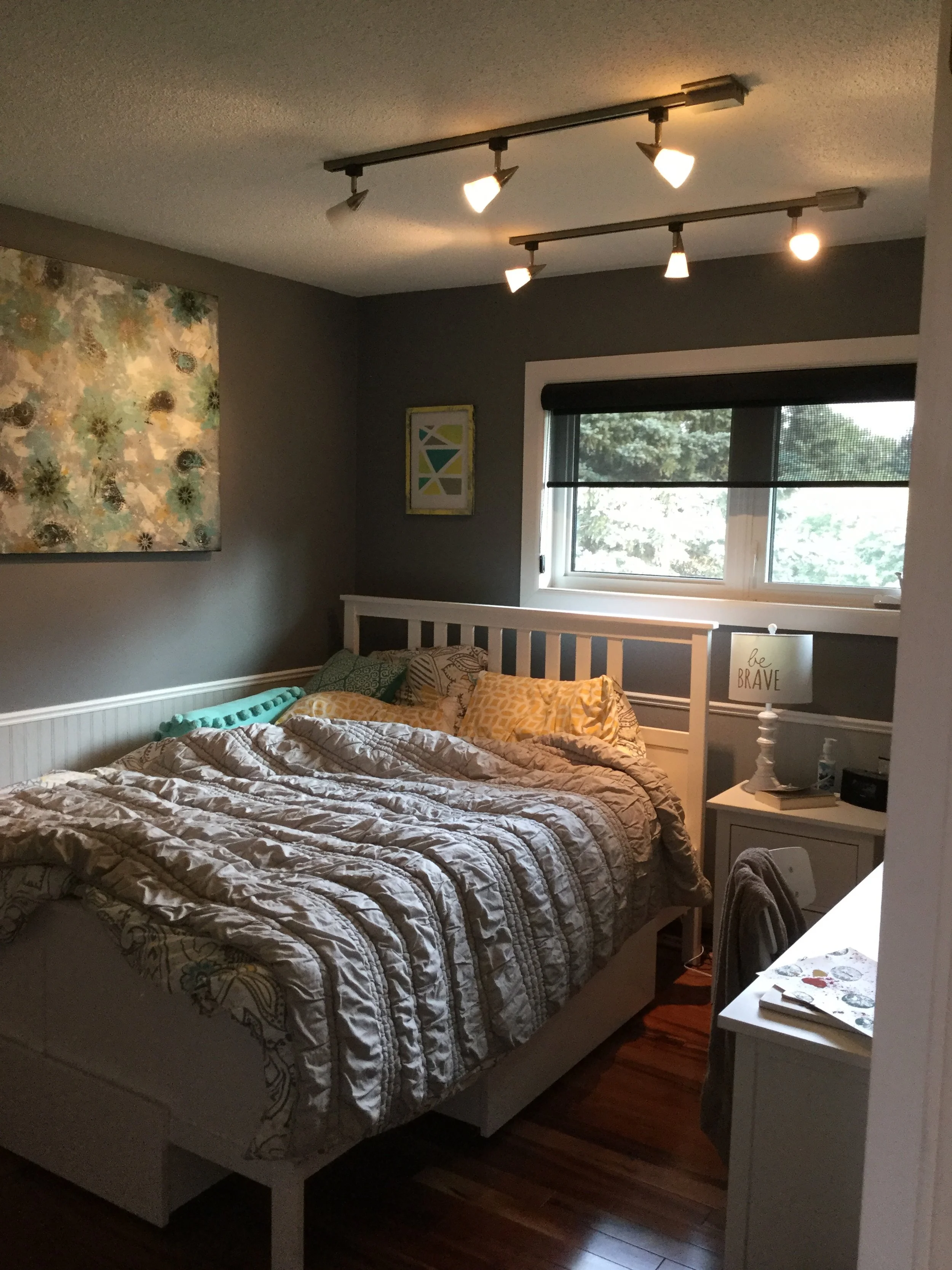
BEFORE + AFTER
We opted for wall mount faucets for the vanity and the bathtub and this meant adding a framed ledge along the back wall, since this is an exterior wall. Not only does the ledge offer the ability to easily switch out decor and styling through the seasons but it was the perfect way to have tile behind the tub without taking it to the ceiling. Finishing it off with a quartz top makes the area easy to care for. The accessories we brought into this space are from our retail shop, Homestead, and the artwork is by Stefani De Nysschen.
GET THE LOOK
primary suite
a moment for the shower
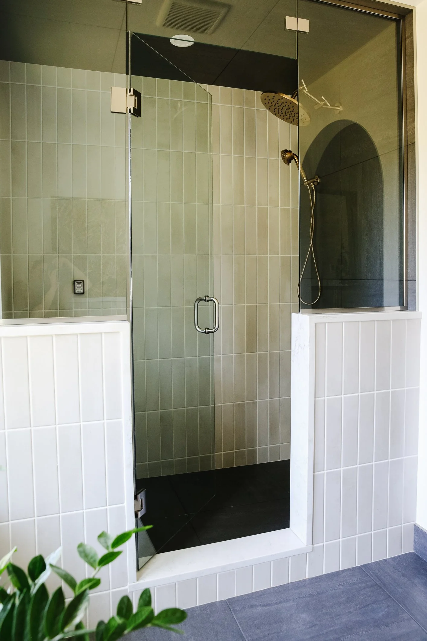
Custom showers are usually much more complex than they look and here are a few quick tips that can give your investment some valuable longevity:
think about the placement of your shower controls. t’s no fun to turn the water on and have to dart out of the way of a freezing cold stream of water. Tucking the controls near to the door makes them super accessible and avoids shivering while the water heats up
steam shower considerations - they’re something we’re being asked about more and more all the time but there are a few complexities to think through if you’re planning a steam shower like this one. Consider where the components are going to be housed, how large are they and how will you access them…also ensure that your tile is compatible with a steam shower, as not all are
think about glass height - if you’re planning for a steam shower, you’ll want glass to run to the ceiling to trap the steam in the shower. This particular glass configuration has a louvered glass panel over the door that can be opened to let a bit of cool air in if needed
think about drain location - this will need to be decided fairly early and for certain types of drains/floor systems even before your building plans are finalized. If you’re thinking of working with a design team, this is just one example where you’ll want your design team involved as early in the process as possible
main bath
This is the main bathroom in the house and it was ready for a refresh. Since there was only a bathtub in this space prior to the renovation, that meant that every shower had to be taken downstairs. The previous principal bedroom was turned into a guest room/office and with the addition of an ensuite, that meant this bathroom could be used mostly for guests. A shower makes it more practical for guests and working with the previous footprint was a cost-saver in this simple layout.
GET THE LOOK
fieldstone reno
We are thrilled to have this project featured in print and online at Western Living Magazine, found here
Thank you so much for reading through our Fieldstone Reno project reveal! If you’d like to see more of this project, it’s on Instagram too at #FDfieldstonereno
Photography by Delina Langridge
Design and Styling by Farmer’s Daughter Interiors
Accessories and decor (some) by Farmer’s Daughter Homestead. Browse our collection here
Paintings by Stefani De Nysschen - Life with Fawn
If you’d like help with your own remodel you can inquire here or book a Consultation to chat through your most pressing questions. Please note, we’re already looking ahead into our 2024 project calendar.


We’re very excited to be sharing a completed kitchen and dining room renovation from our Oakmoore project with you today!
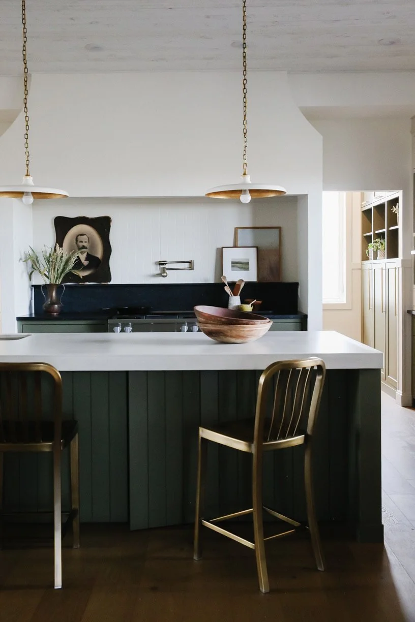
This family home is located less than an hour from Swift Current, SK and nestled into the rolling hills of the beautiful Prairies we enjoy here in Saskatchewan. Our clients came to Farmer’s Daughter Interiors looking to make better use of their open plan kitchen + dining space while creating a bright, airy feeling kitchen where they could enjoy hosting their grown children (and their families) for weekend get togethers and large family holiday meals.
Read on for how we worked with our clients to bring this renovation to completion.