PROJECT REVEAL // Chinook Kitchen
On Instagram: #FDchinookkitchen
Today we’re so excited to share our Chinook Kitchen project with you! Warm + inviting yet fresh + contemporary, this kitchen renovation is chock-full of details that make it a unique, functional, and inspiring space for our clients to live + cook in.
Our clients came to us with a 1980s oak kitchen and wanted to completely refresh the space. Our design was inspired by our homeowner’s love for entertaining + hosting as well as baking with their grandkids. Read on to see how we incorporated their wish list into this space!
THE GOAL
With their existing kitchen layout, our clients had a large peninsula that divided off the dining room from the rest of the kitchen space. They turned to Farmer’s Daughter Interiors to create a fresh + updated feel in the kitchen, add functionality in the design of the cabinetry + wanted the new design plan to get rid of the obtrusive peninsula while opening up easy access to the dining room.
THE CHALLENGE
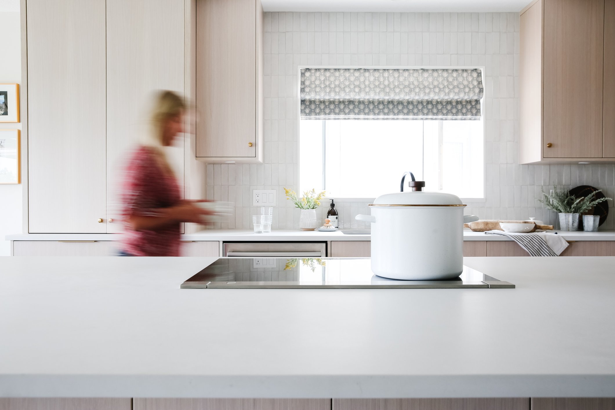
Without moving any walls or making any structural changes, our clients were planning to replace the cabinetry + appliances and re-do the ceilings however, they were really hoping to keep their black leather floors… Working with the floors felt like a real challenge at first but with careful consideration of a whitewashed oak cabinet colour, and by keeping the rest of the finishes on the lighter side, we were able to completely transform the feeling of the black floor and keep the room feeling light + fresh, instead of weighed down by the darker floors.
We were aiming to keep the kitchen appliances in their original locations to simplify and expedite the renovation process so we created a new cabinet plan focused largely around the original appliance locations. The layout was already quite efficient so we felt good about working with what was there. Locating the fridge and a built in wall oven on the same wall gave us room to design a counter-to-ceiling baking cabinet to the left of the sink.
This simple cabinet quickly became our clients’ favourite kitchen detail. It houses all her baking ingredients + appliances close at hand and keeps them tucked behind functional retractable doors. She told me the other day she’s had many days of baking with the grandkids + making recipe books together - just what she was envisioning when she decided to embark on this project!
As far as the kitchen’s other features…? There is also a hidden cutting board over the garbage can on the island, a built-in knife block in a drawer and a hidden drawer-within-a-drawer to keep the drawer heights looking the same across the kitchen.
THE PALETTE
We used a quartz by Caesarstone on the countertop throughout - it’s subtle but has a beautiful pattern and soft hand to it when you’re up close + working on it. The wall tile is a Morrocan zellige + it’s uneven shape lends a soft, casual feel to the room but still provides enough interest to hold its own on a wall of that size. We chose brass hardware + lighting for the warmth it lends to the room, assisting in a feeling that’s not too crisp + streamline overall.
FROM EVERY ANGLE
Even the smallest of details can contribute to an overall design direction. In this case, we designed a very slim crown profile on the cabinetry which keeps the focus on the woodwork itself and contributes to a modern feeling in the room. We needed the ceiling to be quite level to make this work but since the ceilings were redone as part of this project, the slim crown worked out well.
THE COFFEE BAR
Prior to the renovation, our clients had a small nook where they made + stored their coffee equipment but we knew we could devise a solution for more space and a much roomier feel {before photos below}
BEFORE + AFTER
Everyone’s favourite - the before.
You gotta love a good before and after!
COFFEE BAR
The Moroccan zellige tile on the backsplash is my personal favourite feature in this kitchen. There is a fair amount of it along the perimeter + on the coffee bar, so we knew we needed something subtle but interesting and the zellige is the perfect balance of both in my opinion.
I love that it functions so well for our clients. I was just chatting with them the other day and now that they’ve had some time to use the kitchen and put it to the test with baking with the grandkids and hosting meals for friends, they both said there isn’t one thing they would change. That’s our ultimate goal with any design project and it’s definitely my favourite thing about how this room came together.
I love renovation projects because there’s often a challenge in an existing layout, an existing material that needs to stay or a design limitation in one way or another… it forces us as a design team to be more creative and work outside our comfort zone somewhat, which is a great way to grow.
See more of our Chinook Kitchen project on Western Living found here.
Design + Styling: Farmer’s Daughter Interiors
Photography: Delina Langridge
Accessories: Farmer’s Daughter Homestead


