BEFORE + AFTER: Wailea Bath
On Instagram: #FDwaileabath
We love a good bathroom remodel here at FDI, especially when we get to share a ‘before and after’ with you!
As one of the most frequently used spaces in a home, a bathroom remodel affects daily life in such a positive way. Just think about how much time we actually spend in our bathrooms in a given week. Crazy, right? Although they can be a bit of extra work and sort of a pain to remodel, we think it’s well worth it!
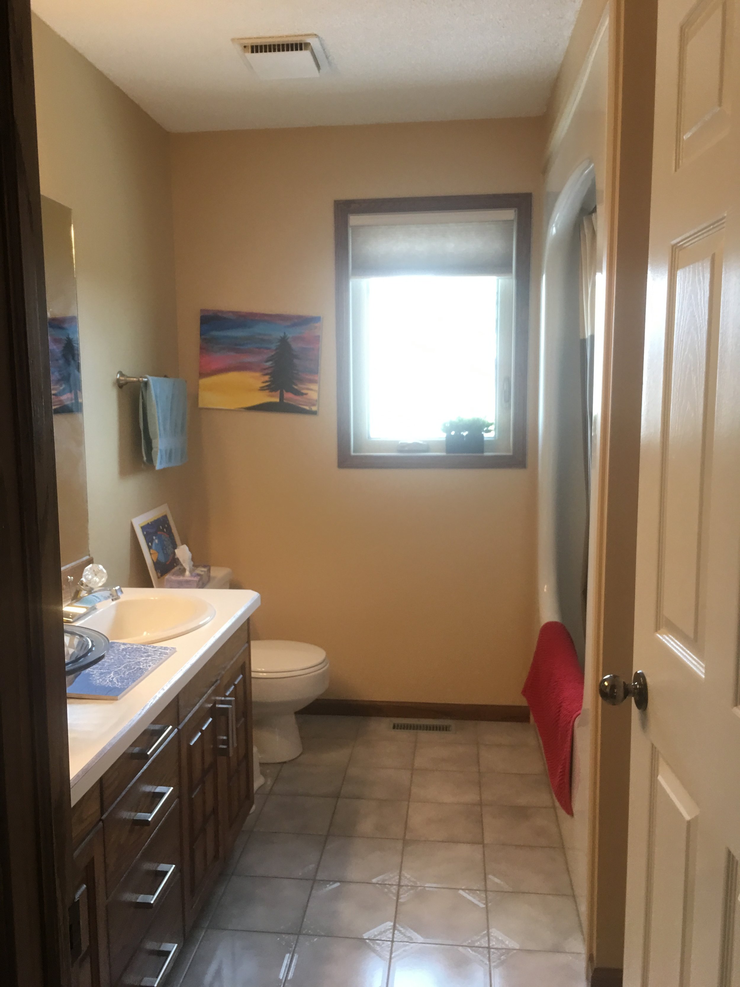
Our clients came to us wanting to create a fresh space for their two coming-on-teenage daughters. Some of their top priorities included increasing the amount of accessible storage in the room, brightening the shower, and ensuring the room still tied into the rest of the home.
Take a look below at how we helped transform this space!
B e f o r e
A f t e r
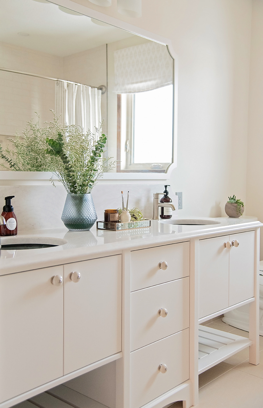
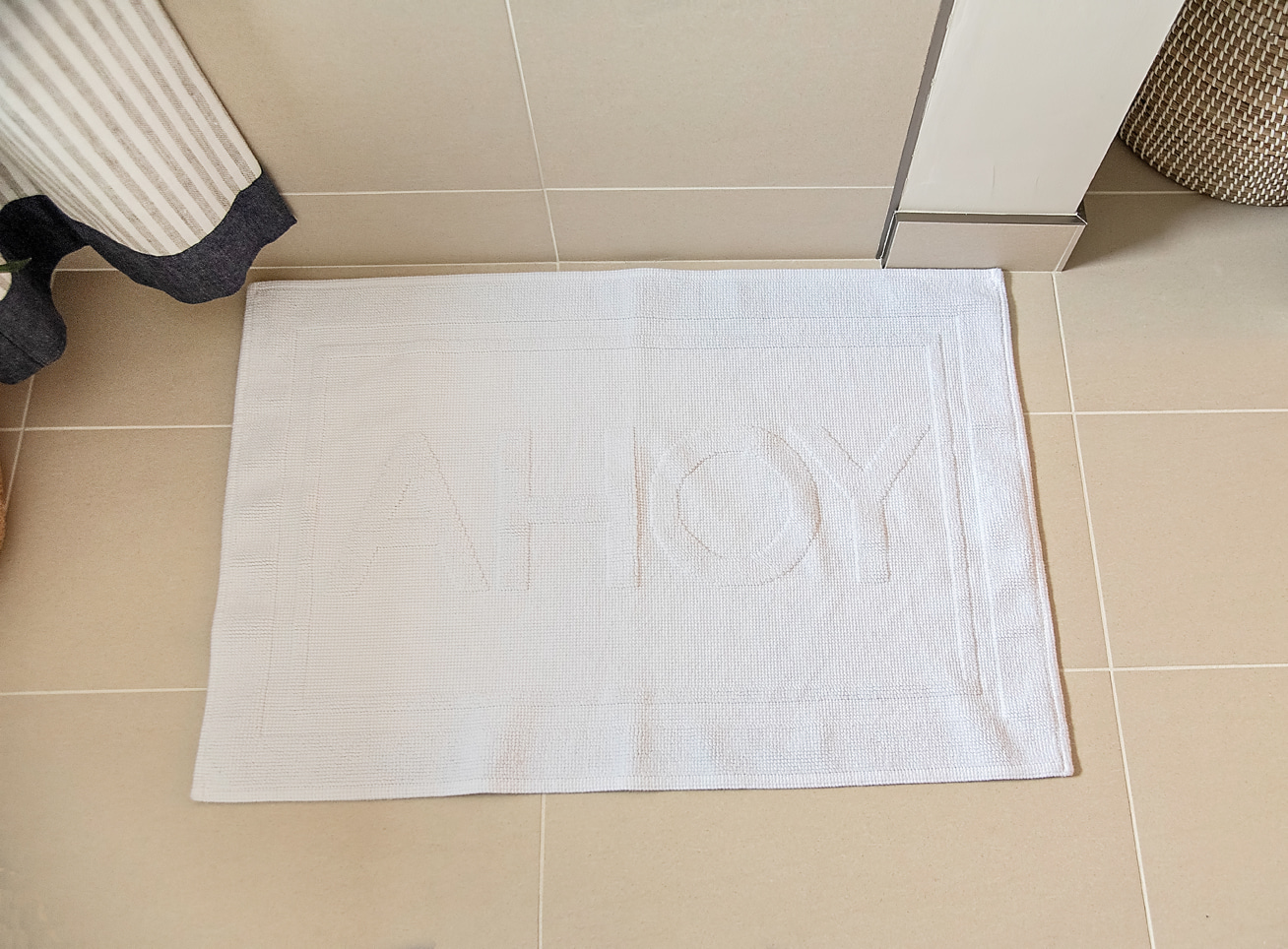
To kickstart the project, we took inspiration from our clients’ recent family trip to Hawaii and the hand-crafted wall art they brought home (seen below). We wanted the space to feel laid back and beach-y with a twist that didn’t feel cliche. And although we’d love to take credit for them, this concept worked great with the blue-glass sinks our client had already selected…aren’t they gorgeous? Selecting a mostly neutral palette and varying tones of white means this space now feels bright and fresh but still warm and classic. Keeping the window trim consistent with the rest of the house ensured that the bathroom flowed well together with nearby rooms and actually added a nice bit of warmth to a plain wall. We selected a floor that has the tone and texture of sand and kept the tile layout simple to ensure it didn’t take away from some of the other features we wanted to add.
We love working with white cabinetry and love it when our clients do too. A custom built vanity meant we had lots of room for creativity and were able to take our clients’ initial sketches and add some fantastic details to give it just a bit of an edge. Pieces like the ceramic knobs, rounded toe-kick detail, and that fabulous quartz countertop from Cambria work together to create a cohesive look that’s far from boring. Speaking of the countertop, we presented our clients with two options and love that they chose this one - it’s got a subtle wave detail in the pattern that is a nod to that bit of perfection where the ocean tide meets the sand. Okay, did you guess? Yep, we’re all about the details. The profile of the countertop edge combined with the extra-high quartz backsplash and those pretty scallop-shaped corners just might be our favorite thing about this room.
A f t e r
B e f o r e
B e f o r e
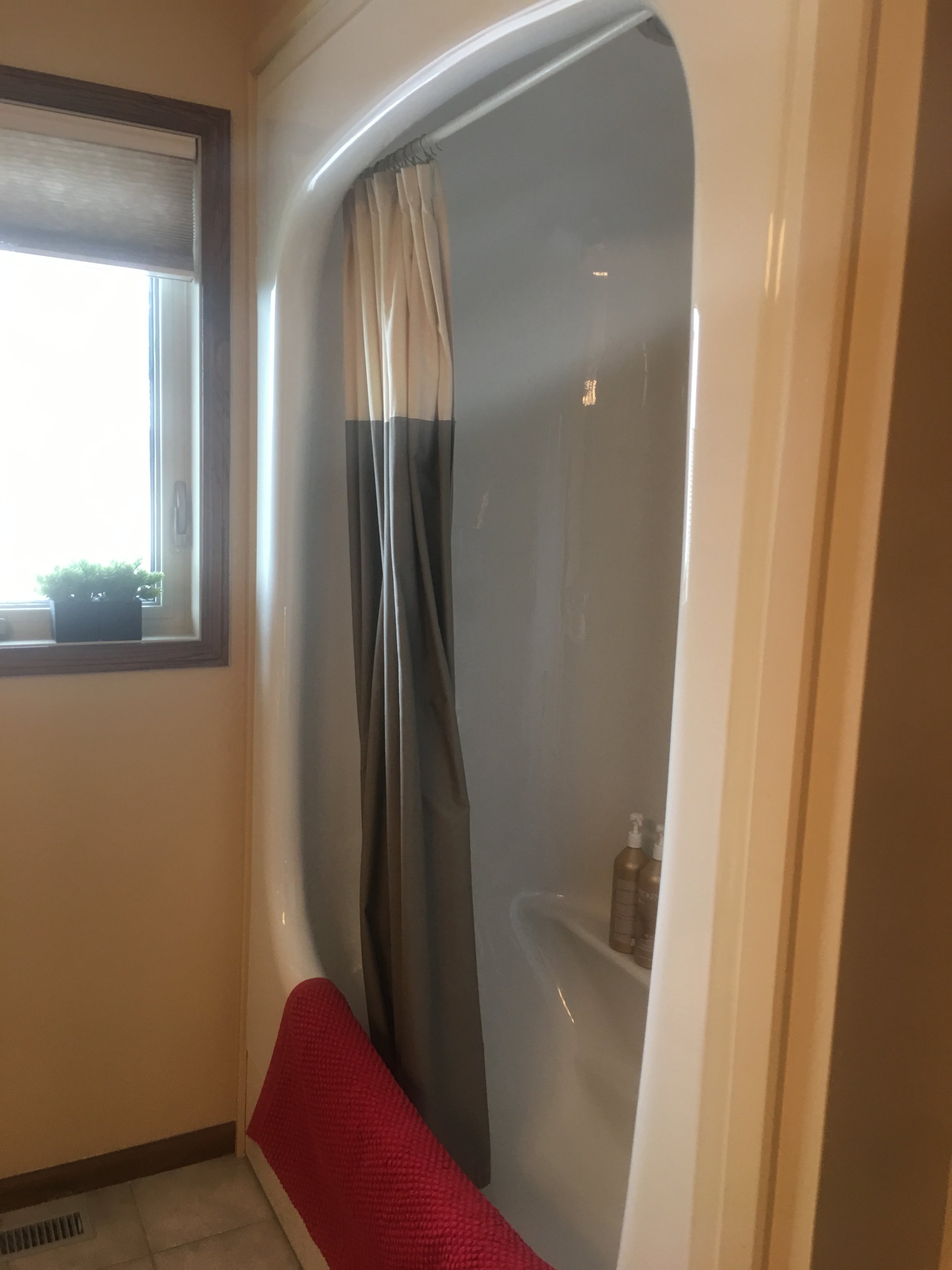
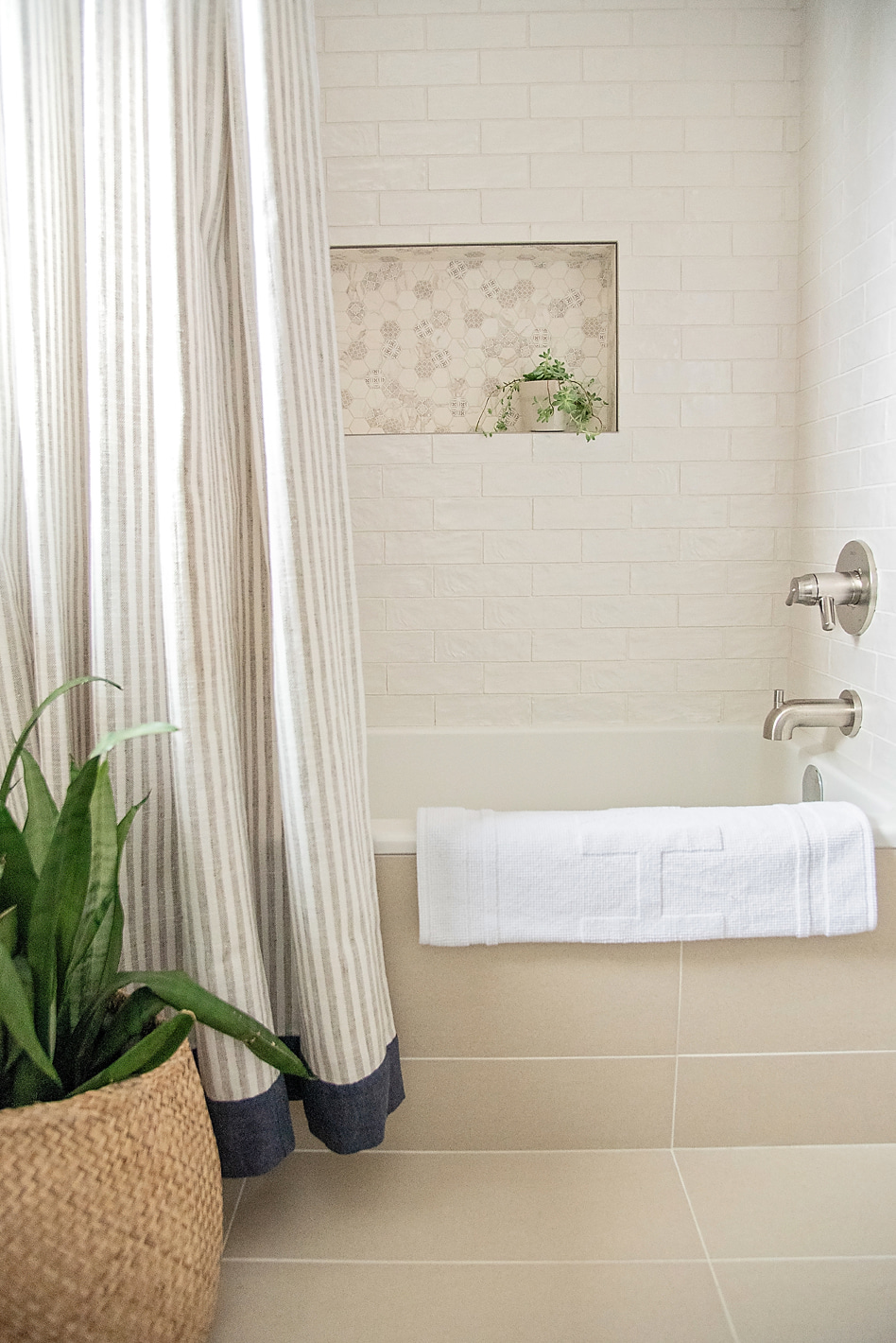
Let’s take a closer look at the shower space. Removing the shower surround allowed more light to enter the shower right off the hop and we knew we wanted a light colored tile with some detail. Remember how we kept the floor simple? This allowed us to select a smaller tile shape for the shower without overwhelming the space.
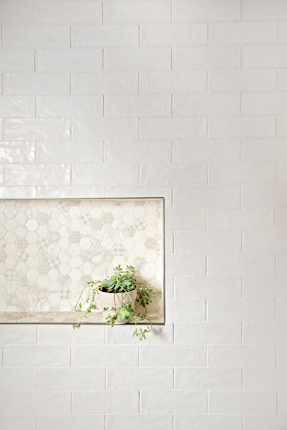
We presented our clients with two or three options for the shower tile and when they took this particular sample home, their daughters absolutely loved it! We’re not sure who actually made the final decision but are so happy with how it turned out! If you look close, you can see the pearlescent sheen that gives this tile it’s slightly feminine vibe - gorgeous.
The hexagon accent tile was a fun, youthful detail and plays nicely against the coastal stripes in the custom shower curtain.
A f t e r
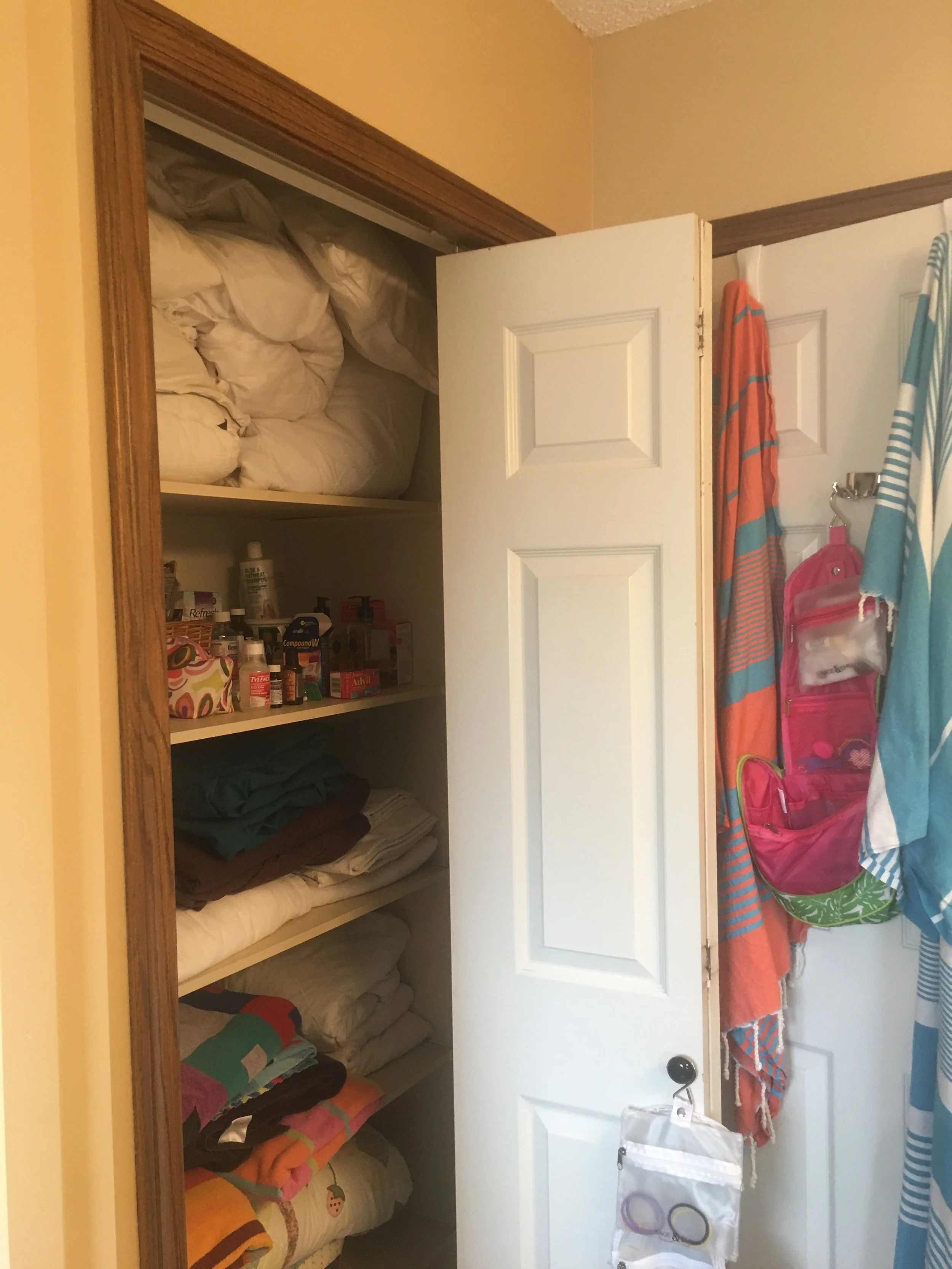
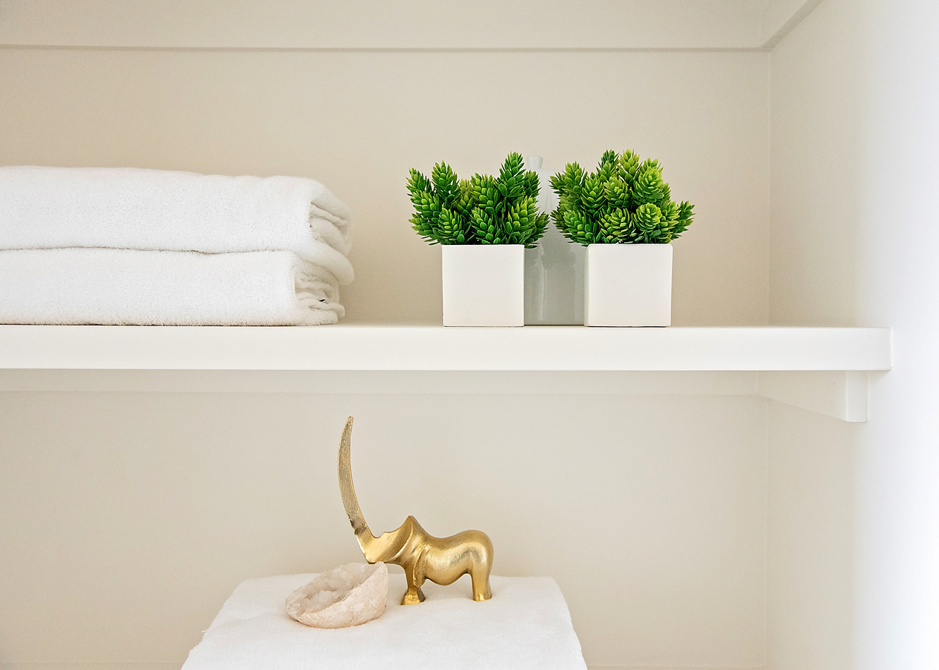
Now, this closet was one of the things that just wasn’t working for our clients and was something they mentioned right away. We knew we wanted to have the bulkhead removed and we also initially discussed the idea of building this area in with custom cabinetry or leaving the space as open as possible. In the end, our clients decided to leave this area super accessible and add some open shelves which made the room feel significantly larger. The gained floor space is an awesome spot for a laundry hamper (or two!) and the shelves leave lots of room for towels, baskets, extra bedding, etc.
B e f o r e
A f t e r
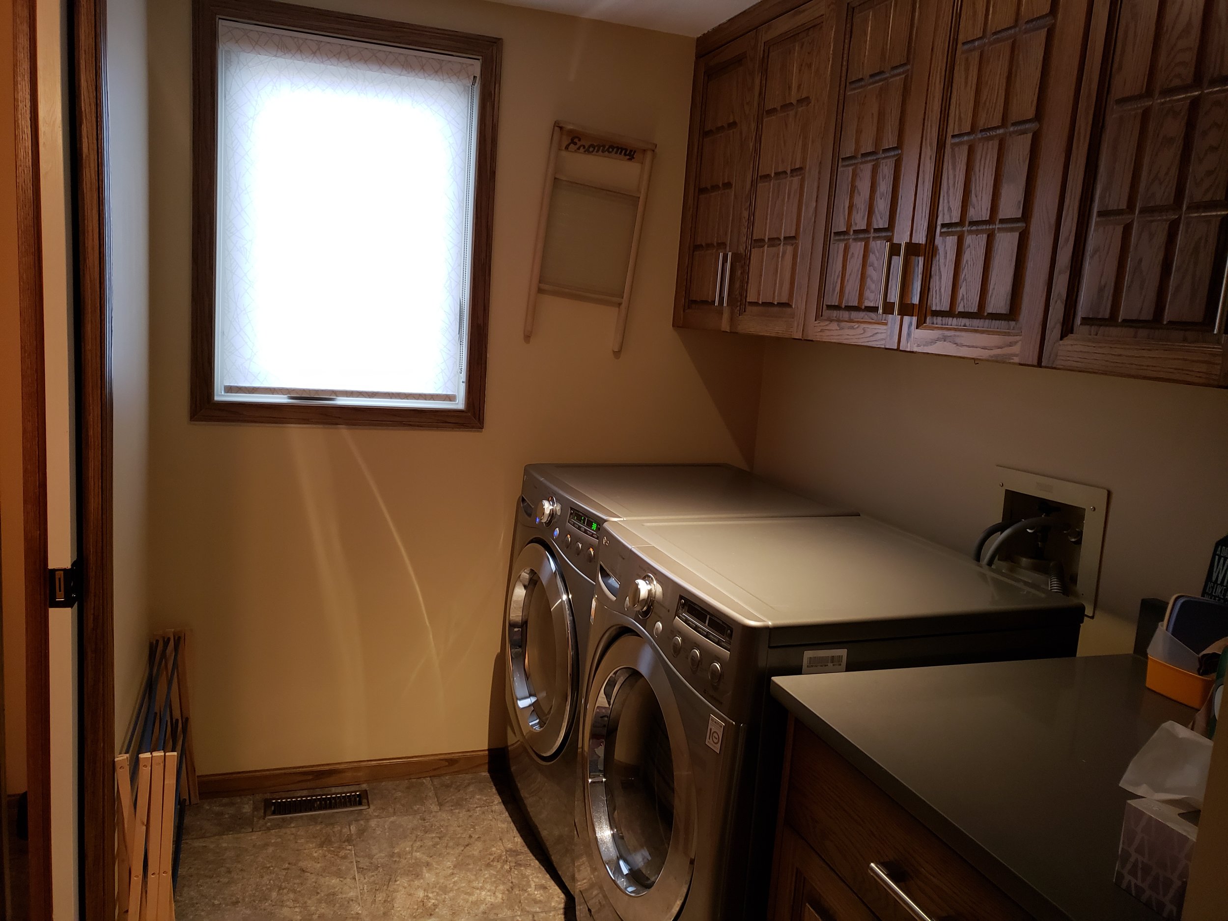
BONUS! While the laundry room wasn’t totally part of the project, our clients wanted a quick freshen up to this room, and we found just the thing…..
B e f o r e
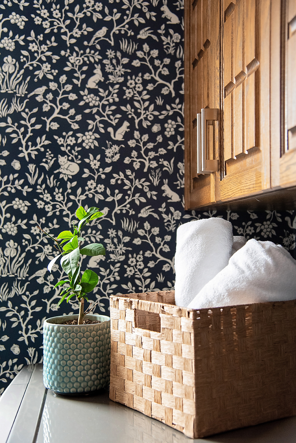
A f t e r
Ta-da!! Wallpaper! Literally, that is the only thing that was added to this room and just look at the dramatic change!
This pretty pattern (and many more) are now available through our studio shop. We even have an installer we can recommend if you’re local.
So there you have it. We absolutely loved working with these clients and the transformation that took place in this bathroom! Our hope is that we’ve created a space that’s added functionality, beauty, and a fresh feeling to their start and end to each day!
Do you have a room you’re feeling desperate to remodel? Let us know in the comments below or get in touch with us and tell us about your space.











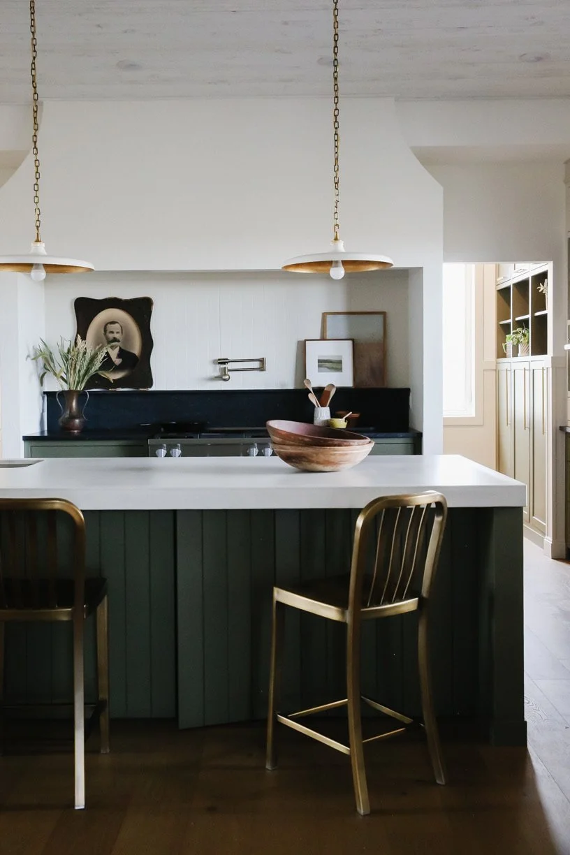
We’re very excited to be sharing a completed kitchen and dining room renovation from our Oakmoore project with you today!
This family home is located less than an hour from Swift Current, SK and nestled into the rolling hills of the beautiful Prairies we enjoy here in Saskatchewan. Our clients came to Farmer’s Daughter Interiors looking to make better use of their open plan kitchen + dining space while creating a bright, airy feeling kitchen where they could enjoy hosting their grown children (and their families) for weekend get togethers and large family holiday meals.
Read on for how we worked with our clients to bring this renovation to completion.