BEFORE + AFTER: Hilltop House
On Instagram: #FDhilltophouse
Meet our Hilltop House project: a fully renovated bungalow nestled in the hills just outside of the city. With sweeping country views and blue skies to the horizon, our clients have created the perfect place to raise their growing family in the countryside. These clients weren't afraid to get their hands dirty, completing much of the renovation work themselves and putting their hearts into their new home.
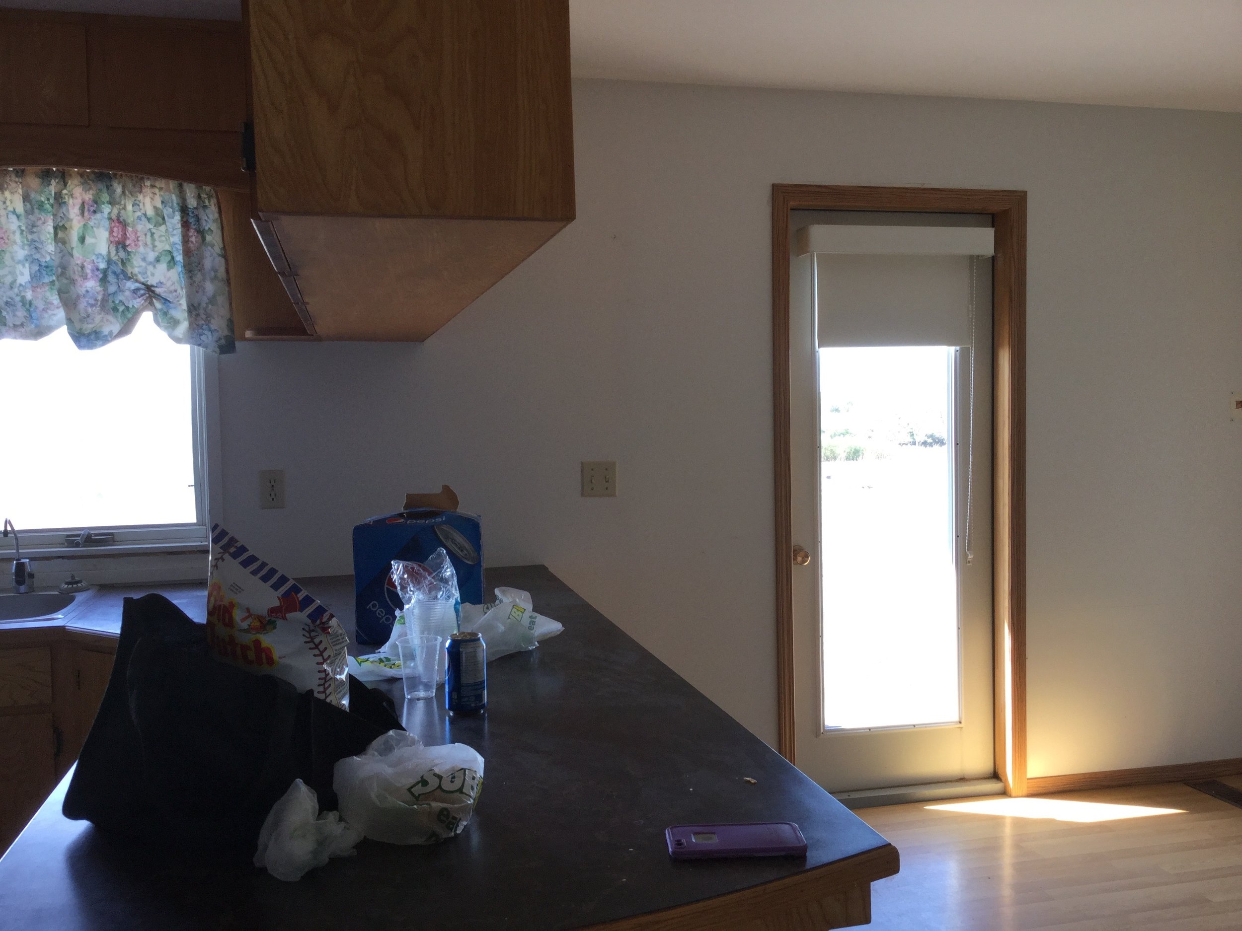
B e f o r e
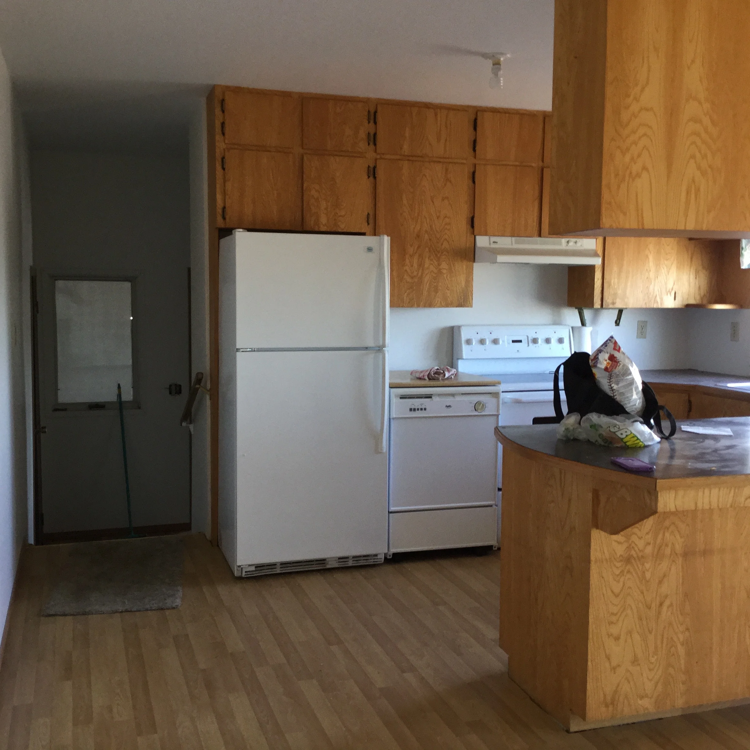
The space before was a generous size but the cramped kitchen layout wasn't a great fit for this young family.
A f t e r
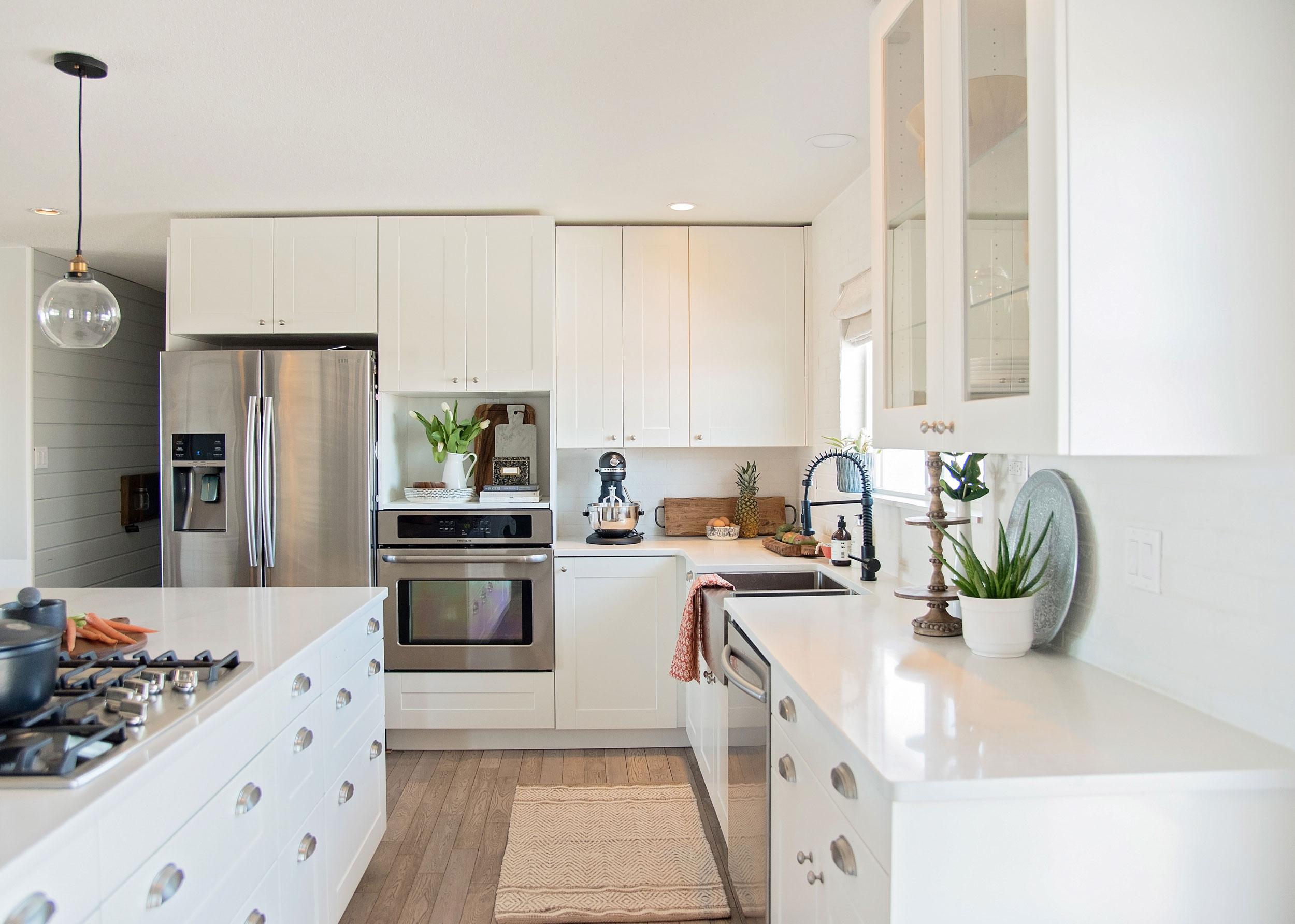
Our clients craved a fresh look and a large island for baking, breakfast, and after-school snacks.
By relocating the dining room to occupy part of the adjacent (extra large) living room, we were able to free-up space for the kitchen layout our clients wanted and create a huge bonus space in the built-in desk that provides not only a great spot for craft projects and kids' homework, but additional kitchen storage for glassware + cookbooks.
B e f o r e
A f t e r
A fun D.I.Y feature in the desk space is the fabric-covered cork board that provides a patterned backdrop to pin to-do lists and recipes and adds softness and texture to the desk area. Warm underfoot, solid oak hardwood with a grey-toned stain is a perfect contrast to the white cabinetry and lends a farmhouse feel to the room.
B e f o r e
A f t e r
What's not to love about mixing metals? Subtle changes in metals from the black faucet, nickel hardware, and brass accent on the lighting all add interest to the otherwise all-white kitchen.
One of my personal favorite features of the space is the white brick backsplash that we ran up and over the kitchen window, as well as along the entire kitchen wall and around the patio door. We wanted to give our clients a feature that would add character and timelessness to the home and choosing an exterior wall as the location somehow feels as though the brick may have always been a part of this home. Talented tile-layers created an outside return on the brick around the window, rather then using a standard tile edging to add the the authentic feel of this feature. Like we say, it's all in the details!
The large island is topped with Caesarstone quartz; a timeless, durable material without the maintenance required by a natural stone like marble or soapstone, making it a fantastic practical selection for a growing family. White-painted mouldings were added in the dining room and down the hallway to contribute a visual break in the wall color, which is a super soft fresh-grey, Benjamin Moore's Gray Owl OC-52.
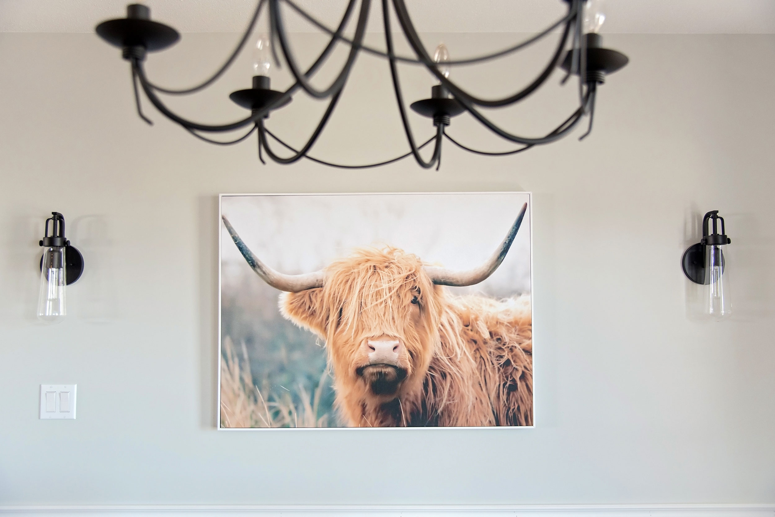
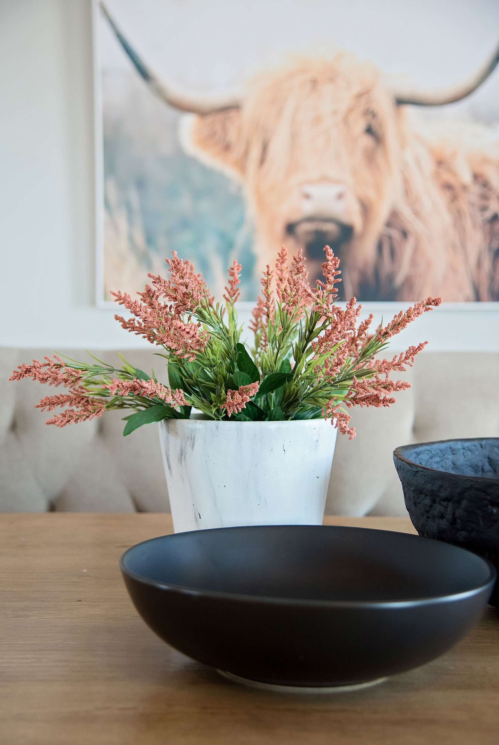
The new dining area is defined by an added window and a black farmhouse-style chandelier. Sconces fill the wall space and flank our favorite highland cow print which is a cheeky play on the home's country location.
It was such a pleasure to contribute to this project alongside our clients as they worked toward creating their country home. Besides over-the-moon clients, our goal is always to improve both aesthetics and function, which we feel we achieved with certainty in this home. Hopefully their home will be enjoyed by this lovely young couple and their children for many years to come!
Kelsey x.










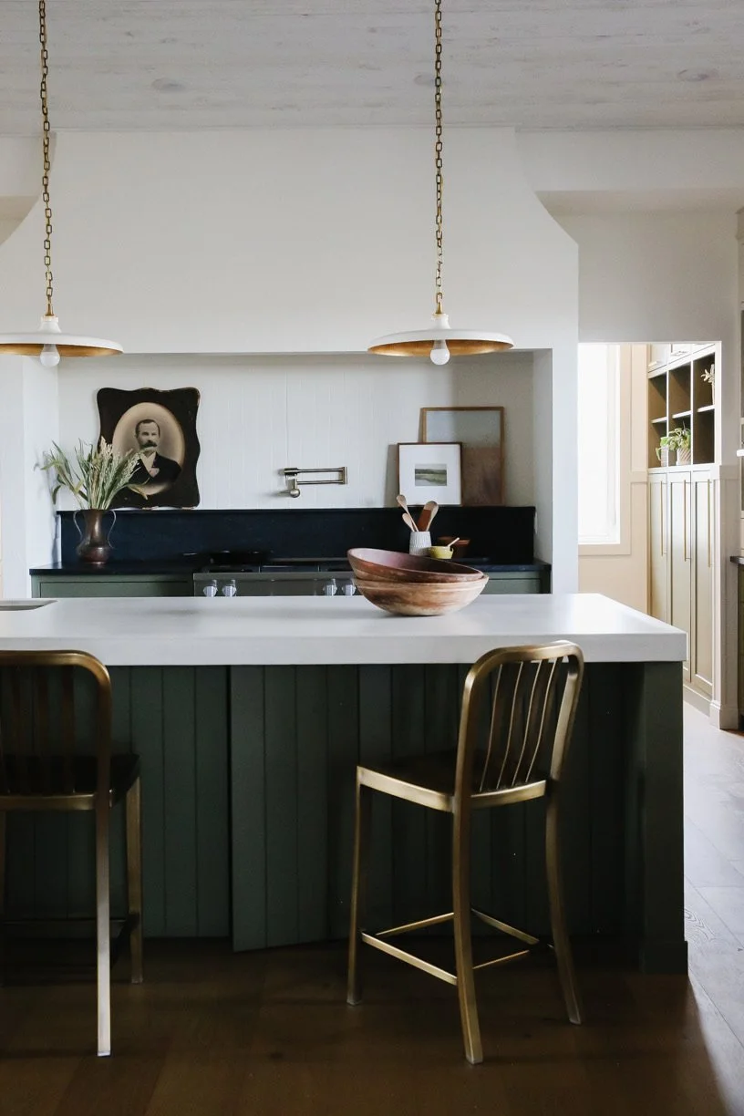


We’re very excited to be sharing a completed kitchen and dining room renovation from our Oakmoore project with you today!
This family home is located less than an hour from Swift Current, SK and nestled into the rolling hills of the beautiful Prairies we enjoy here in Saskatchewan. Our clients came to Farmer’s Daughter Interiors looking to make better use of their open plan kitchen + dining space while creating a bright, airy feeling kitchen where they could enjoy hosting their grown children (and their families) for weekend get togethers and large family holiday meals.
Read on for how we worked with our clients to bring this renovation to completion.