52 C E N T R A L // Exterior update
Welcome back to our 52 Central series where we share an inside look into the process of designing our own studio + retail shop!
As we mentioned in our previous post {if you missed it, you can catch up here}, our new space features two entrances; one for Farmer’s Daughter Interiors + the other for our interior design shop. We love the original brick and large tree that is centred on the building. Our vision for the exterior was to create an inviting space and something eye catching from the street.
The inspiration for the exterior is mostly drawn from my travels; I’ve always loved how European shop fronts are mostly all one colour, quaint, warm and welcoming.
before
the process
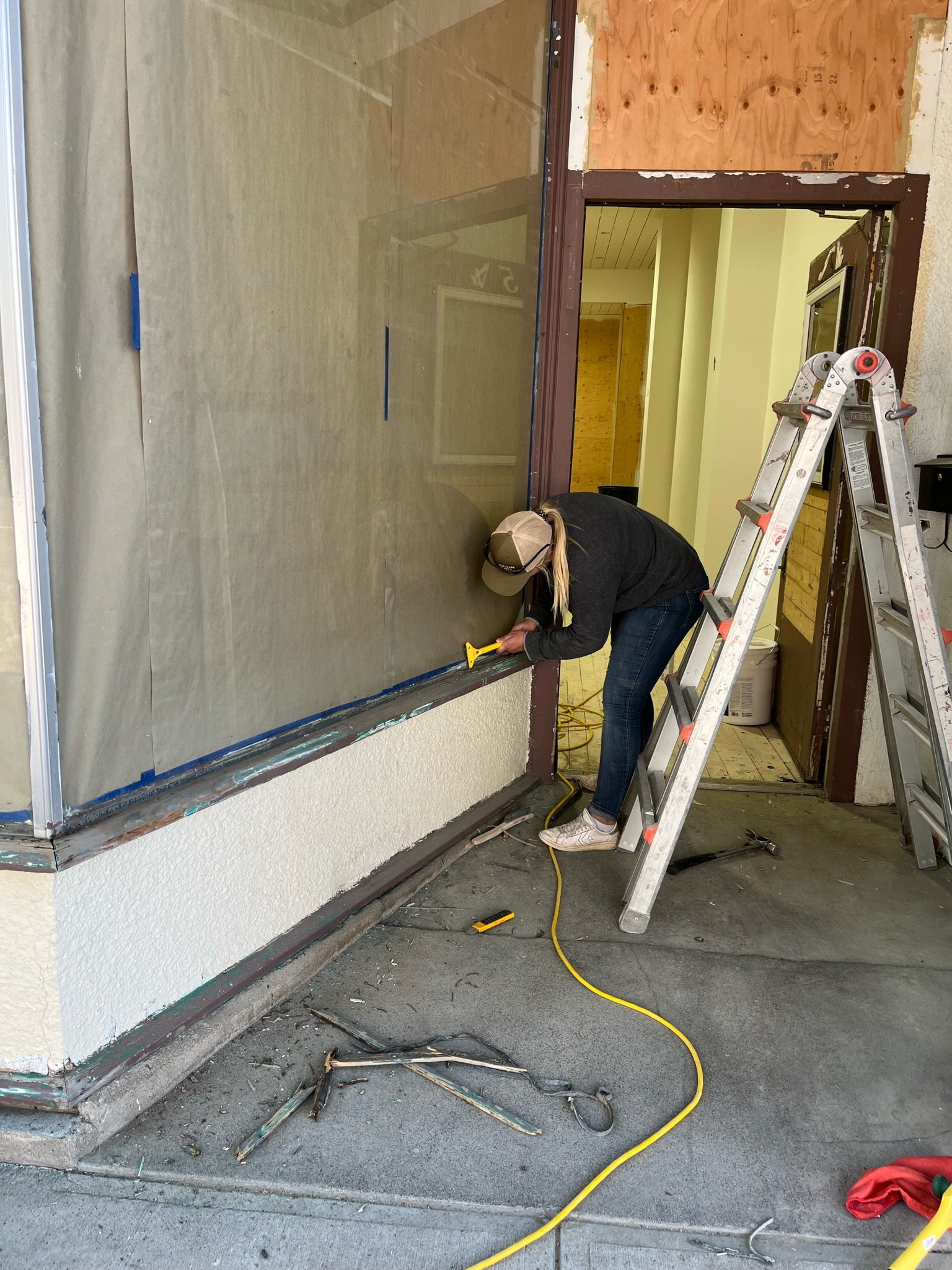
Both my husband and myself tackled the exterior - big thanks to our parents for watching the kids which allowed us to dedicate our time to this project! We started by prepping, sanding +priming.
SELECTING THE PAINT COLOUR
Once the primer was on, the next step was to pick a paint colour. I have always been drawn to green (see: The Farmer’s Daughter Interiors colours, my own kitchen cabinets and this blog post we did a while back), however once I saw the warm white on the brick, I knew it would achieve both an inviting feel and be more visible from the street.
Design tip: when deciding a paint colour, be sure to paint an actual sample {don’t just rely on the paint chips}, look at the swatch from different angles and at different times of the day..
During our Design Consultations, paint colour selection is a commonly asked question. We love helping our clients pick the perfect colour as it is a relatively cost effective task but can change the whole feeling of a home! More info on our Consultation service here.
current
While painting the brick may be somewhat controversial, the white freshened it up so much and was definitely the right move. We have some more we’d still like to do with the exterior but it’s getting there!
Farmer’s Daughter Interiors entrance
Retail entrance - our shop is getting a refresh {more on this later}.
next steps
Exterior signage
Refurbish door
New glass install
Wall signage


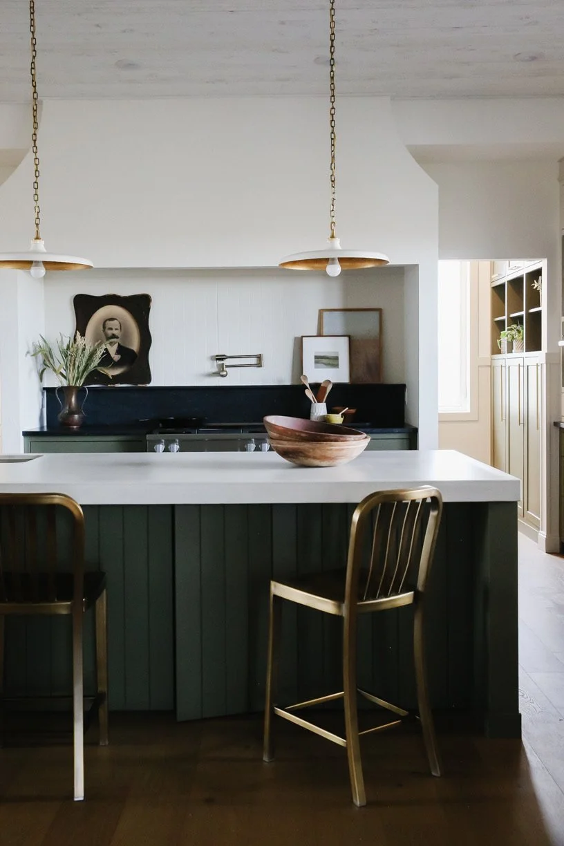
We’re very excited to be sharing a completed kitchen and dining room renovation from our Oakmoore project with you today!
This family home is located less than an hour from Swift Current, SK and nestled into the rolling hills of the beautiful Prairies we enjoy here in Saskatchewan. Our clients came to Farmer’s Daughter Interiors looking to make better use of their open plan kitchen + dining space while creating a bright, airy feeling kitchen where they could enjoy hosting their grown children (and their families) for weekend get togethers and large family holiday meals.
Read on for how we worked with our clients to bring this renovation to completion.