PROJECT REVEAL // Avenue Four Before + After
On Instagram: #FDavenuefour
This master bedroom and bathroom renovation turned an unused seating area into a functional retreat that feels more like a hotel suite than your basic bedroom and is one of my favorite projects to date!
We’re going to share a bit of a look into our Design Process with you on this post so keep reading to find out where we took our inspiration for this project, how we communicate our vision to the clients, + the reasons behind a few of the design selections. Enjoy!
Our clients came to us wanting to freshen up their master bedroom space while making use of a no longer used seating area to add an ensuite bathroom and closet space. As a family of five with three coming-on-teenage children, the solitary main-floor bathroom in their home just wasn’t holding up to the increasing demands of their family. We’ll take a closer look at the bathroom space in just a minute, but first, let’s have a look at the bedroom itself.
After getting to know our clients, I discovered he was born and raised on the Prairies, while she grew up on Canada’s east coast, near the ocean. Since this couple was really open-minded in terms of the design and color palette, there was lots of room for a bit of creativity, however, we knew we wanted to keep the overall feeling classy and restful.
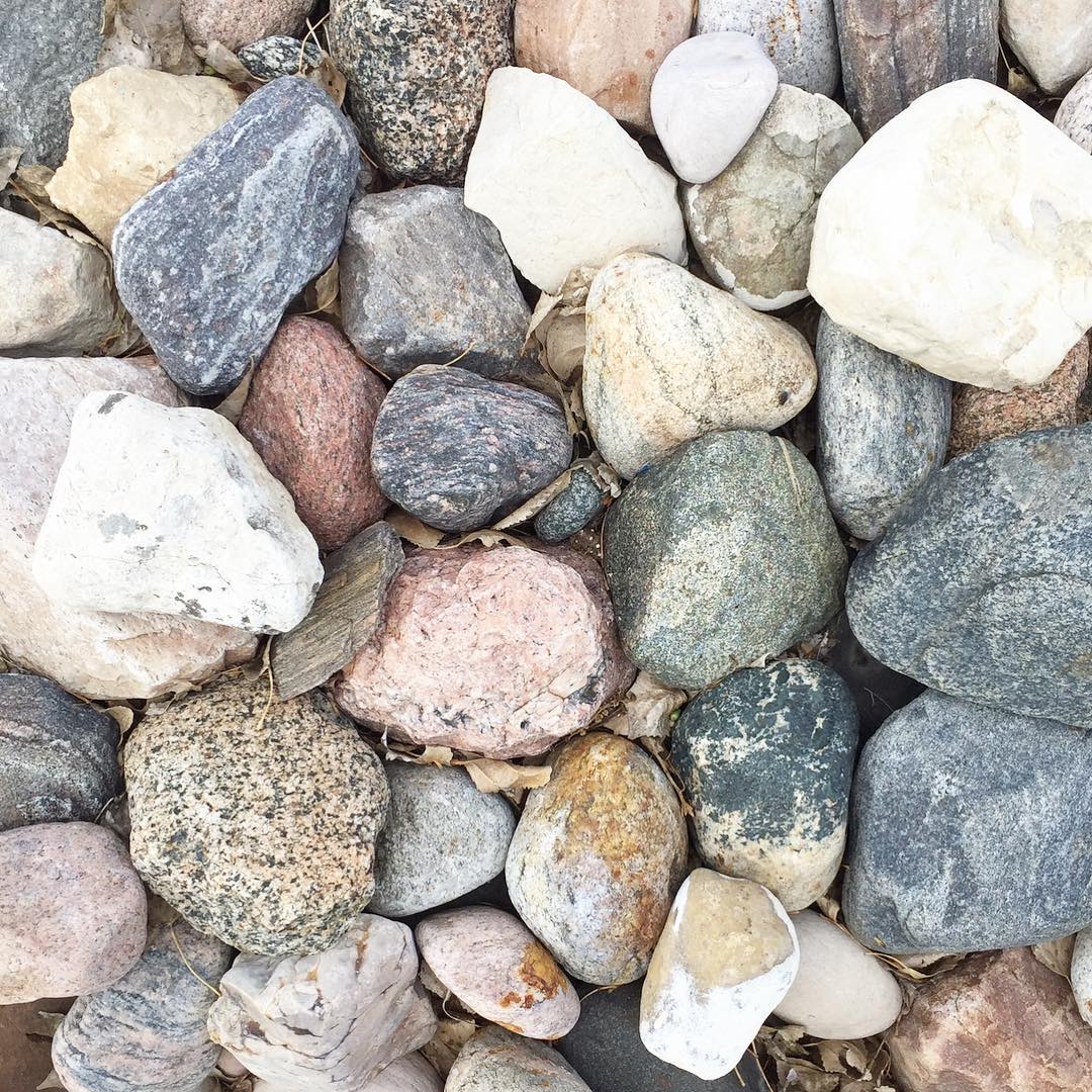
Thinking of the colors themselves, I had the perfect photo in my camera roll - one from the previous summer of piled rocks on I snapped on a country drive . I remember noticing the variety of colors in the rocks and thinking they all worked so beautifully together. For this project, this subtle palette of faded gold and gray-blue was the perfect fit to represent the Prairies and the coastal vibes of the East Coast.
a f t e r
b e f o r e
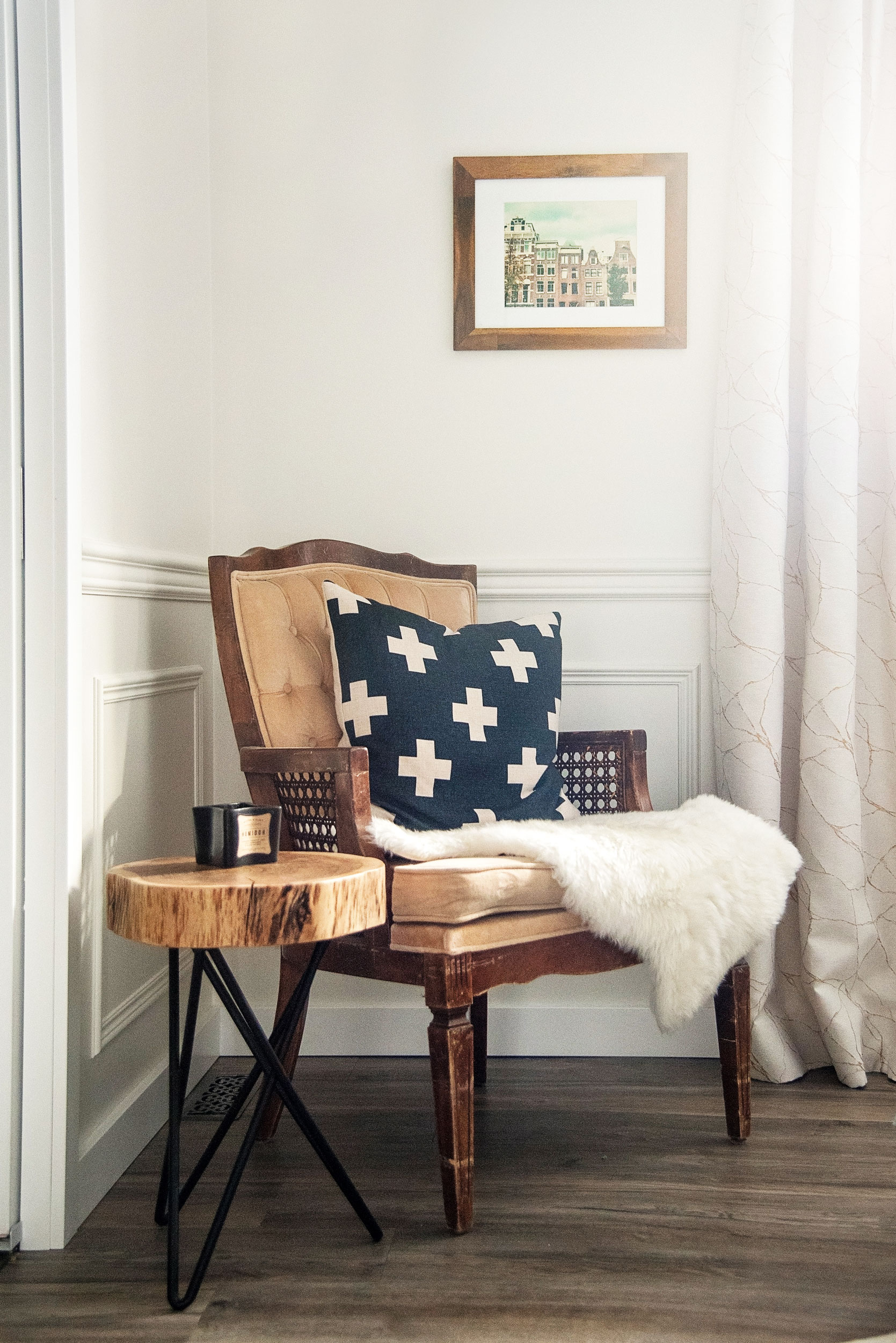
At this stage, we typically discuss any feature design elements that we want the clients to consider incorporating. In this case, one of the first elements I pitched to the clients was adding some panel moulding throughout the bedroom space. It’s simple, subtle, and affordable, and yet makes such an impact while adding fantastic dimension and interest to the room. When they decided to go for it, we specified exactly which moulding profile (there’s tons to choose from!) and drew up a moulding layout so it made it super easy for their contractor to install (not shown). We absolutely love what it did for the room and our clients do too - it really takes the look up a notch and goes a long way in creating a hotel-like, restful bedroom space for this project.
Once we had a general creative direction in mind for the space, we created the Design Board below as a visual for the clients to envision how the space could come together in terms of the design details, furniture, and lighting.
The clients had mentioned they felt their bedroom was dim and poorly lit so we also addressed the lighting. The feature light fixture (available through our in-studio shop) is one of the statement elements of the room and lends that casual but luxe vibe we were going for. Adding two wall mounted sconces keeps the nightstands free and allows for a higher light location - perfect for nighttime reading.
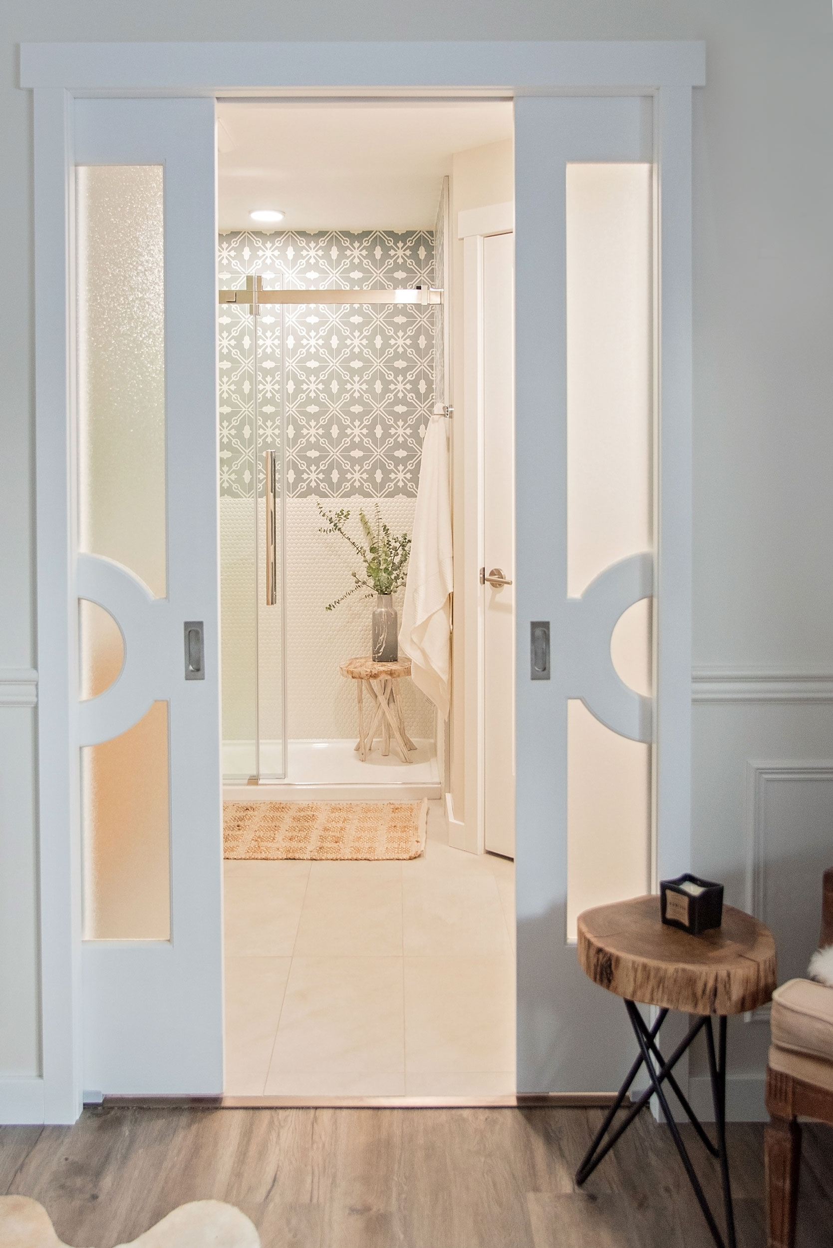
In thinking about the new bathroom space, our clients were excited to take the unused seating area in their current space, and create an ensuite bathroom + closet. We recommended that the space be framed in with a wall to separate it from the bedroom but we left room for a four foot section of sliding doors that, when opened, allow the space to feel open to the bedroom.
b e f o r e
a f t e r
Let’s have a look at the bathroom…
he wishlist for the new bathroom was lengthy: a double vanity, a stand-alone shower, a walk-in closet, a toilet that wasn’t visible from the bedroom, and a small window. We developed several different layout options that hit every item on the list and love the one our clients chose.
Take a peak through the doors… What’s the first thing you notice?
That gorgeous patterned tile, right? By keeping the rest of the finishes such as the floor, the secondary tile, and the countertop relatively simple, we ensured that the patterned tile is the definite star of the show in this room. Off-setting the complex pattern with the simplistic rounds of the white penny tile below it, keeps the look balanced and easy on the eyes. In fact, the penny tile section mimics the panelling in the bedroom to keep the flow consistent from one room to another.
To keep the room feeling as open and as large as possible, we recommended carrying the wall tile around the perimeter of the room, behind the vanity. Our clients really trusted us on this project and it shows in their willingness to complete details just like that, like carrying the tile around the room. It may seem like an insignificant choice but, that is what allows it to feel as open and as large as it does, even though the space itself is relatively small. The pattern adds to the airy effect by tricking the eye into reading the room as larger than it is.
Richard and his crew at Rockside Builders built this stunning custom floating vanity with continuous wood grain, but don’t be fooled, the design isn’t as simple as it looks. Metal brackets had to be fabricated and installed before the new drywall went up to hold this beauty on the wall.
The wall mounted faucets are one of our favorite things our clients chose for the bathroom space…not only because they add a design element to the vanity but also because of their practicality - by lifting the faucet to the wall, the counter space becomes much easier to keep clean from water spots and soap build-up. And who doesn’t love that?
When we design, we’re always thinking about function - how a space lives on a day-to-day basis and how our homes can serve our needs most effectively.
According to our clients, their new bedroom + bathroom is “an absolute oasis” and suits their needs + tastes perfectly. As a designer, I love to see people making an investment in the more personal spaces in their home - the master bedroom and ensuite - because these are spaces we use every. single. day. Adding another bathroom + a bedroom that they look forward to spending time in at the end of the day was truly a game changer for this couple (and their kiddos who now have ‘their own’ bathroom as well) and I feel so fortunate we got to be a part of helping them bring it all together.
I hope you enjoyed our latest Project Reveal and getting a look inside our design process, what we do as designers, and why it’s impactful. The reasons behind the material selections we make almost always serve as more than just a pretty facade, rather, we aim to make smart, functional selections that will accomplish the purposes our clients express to us and look great in the process.
Kelsey x
PS - this project was featured on The Haven List - click here to check it out!
Photography by Candace Schwartz of Jackson Designs - thanks Candace!








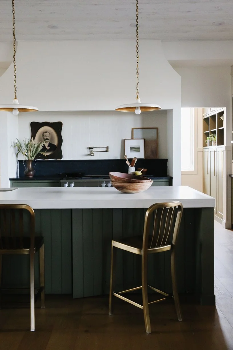



We’re very excited to be sharing a completed kitchen and dining room renovation from our Oakmoore project with you today!
This family home is located less than an hour from Swift Current, SK and nestled into the rolling hills of the beautiful Prairies we enjoy here in Saskatchewan. Our clients came to Farmer’s Daughter Interiors looking to make better use of their open plan kitchen + dining space while creating a bright, airy feeling kitchen where they could enjoy hosting their grown children (and their families) for weekend get togethers and large family holiday meals.
Read on for how we worked with our clients to bring this renovation to completion.