BEFORE + AFTER: Milburn Crescent Project
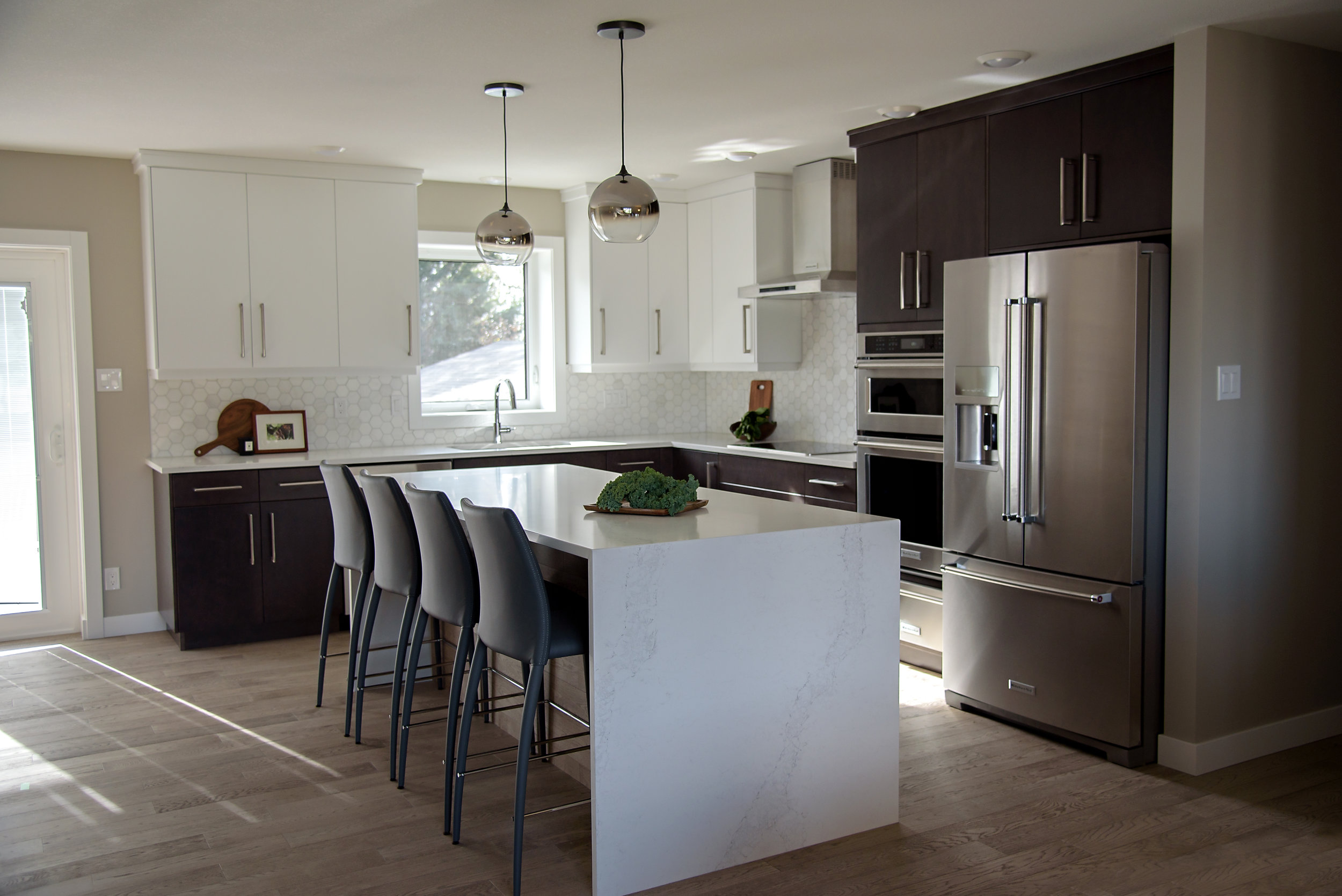
A 1980's oak kitchen gets a major overhaul, adding beauty and functionality to this family home.
Our client craved a more contemporary space and an awkward peninsula + island configuration meant there was room for efficiency and storage to be gained in this kitchen.
We reconfigured the kitchen's layout to be more efficient and installed a statement-making island that provides a fantastic work surface for cooking, baking, and homework.
A grey-veined quartz in a waterfall edge is an eye-catching detail on the island and ties in with the marble hexagon backsplash throughout the kitchen's perimeter.
We used hardwood planks on the front of the island as a warm, interesting detail. Medium grey stools in faux leather add softness and texture in contrast to the kitchen's other surfaces and tie in well with the grey veining in the countertop.
Photography by Jackson Designs


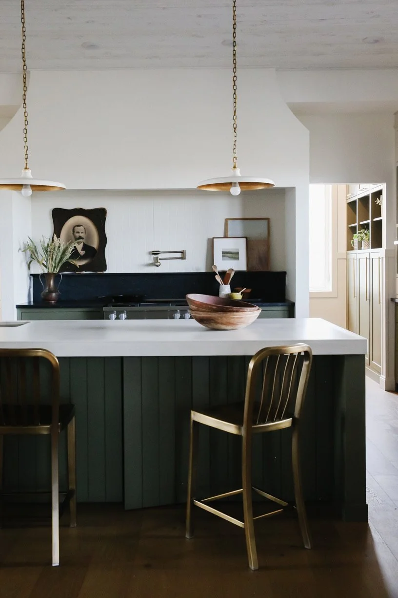
We’re very excited to be sharing a completed kitchen and dining room renovation from our Oakmoore project with you today!
This family home is located less than an hour from Swift Current, SK and nestled into the rolling hills of the beautiful Prairies we enjoy here in Saskatchewan. Our clients came to Farmer’s Daughter Interiors looking to make better use of their open plan kitchen + dining space while creating a bright, airy feeling kitchen where they could enjoy hosting their grown children (and their families) for weekend get togethers and large family holiday meals.
Read on for how we worked with our clients to bring this renovation to completion.